

S
E
P
O
C
P
U
S
i
G
S
T
C
J
R
E
N
T
X
T
O
C
E
O
O
R
E
L
E
Designer
As a designer at SUGi, my role is to lead the art direction, design, and visual storytelling following the branding guidelines and style, delivering cohesive campaigns across socials, digital, web and events.
Greening Cities &
Reimagining Urban Life
SUGi is a global environmental organisation dedicated to planting pockets of biodiverse forests in urban settings worldwide. In a world where hope feels increasingly scarce and the climate crisis is a reality, building a brand rooted in optimism, restoration and community feels both urgent and challenging. Founded in 2019, I joined them in 2021 and had the amazing opportunity to grow alongside the organisation and really be a part of its visual journey.
SUGi’s goal is simple but powerful: to bring people closer to nature through urban forests and help combat the climate crisis. The tricky part is communicating this mission in a way that feels fresh, playful, and positive, without losing the educational and scientific side. How do you talk about climate change, biodiversity, and mental health without sounding heavy or pessimistic?
Problem
The answer is to focus on storytelling. Clean layouts, strong photography, and playful typography help make the content visually striking, while videos and animations bring the human side of the story to life. Creating a small spark of connection with every design and making people curious, inspired, and maybe even a little more hopeful and a part of a global community.
Solution
Graphic Design
Video Editing
Art Direction
Social Media
Web Design
Motion Graphics
L
E
R
O
E
C
O
T
X
T
N
Solution
The answer is to focus on storytelling. Clean layouts, strong photography, and playful typography help make the content visually striking, while videos and animations bring the human side of the story to life. Creating a small spark of connection with every design and making people curious, inspired, and maybe even a little more hopeful and a part of a global community.
Problem
SUGi’s goal is simple but powerful: to bring people closer to nature through urban forests and help combat the climate crisis. The tricky part is communicating this mission in a way that feels fresh, playful, and positive, without losing the educational and scientific side. How do you talk about climate change, biodiversity, and mental health without sounding heavy or pessimistic?
As a designer at SUGi, my role is to lead the art direction, design, and visual storytelling following the branding guidelines and style, delivering cohesive campaigns across socials, digital, web and events.
Designer
A
L
S
O
C
I
M
I
D
E
A
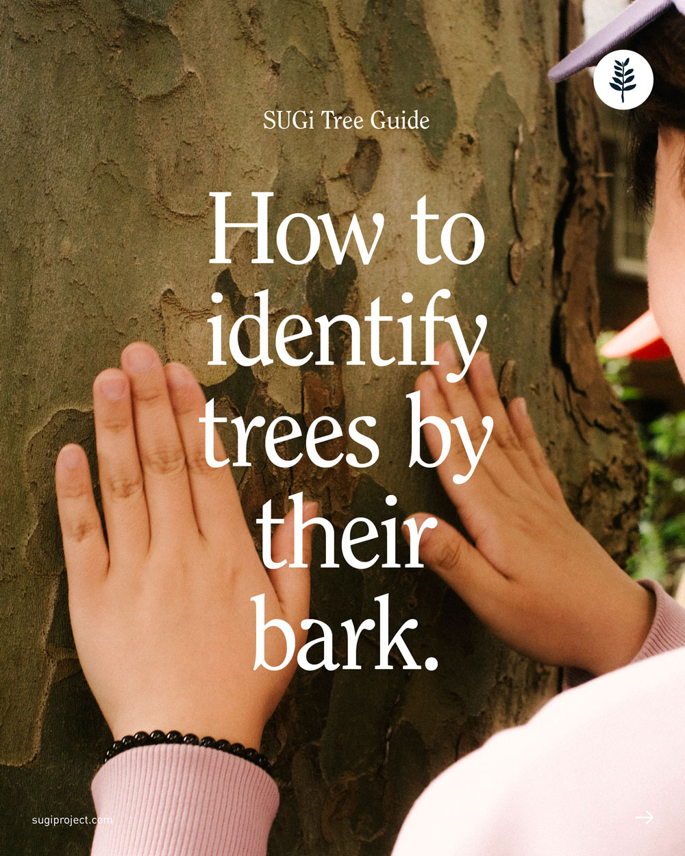
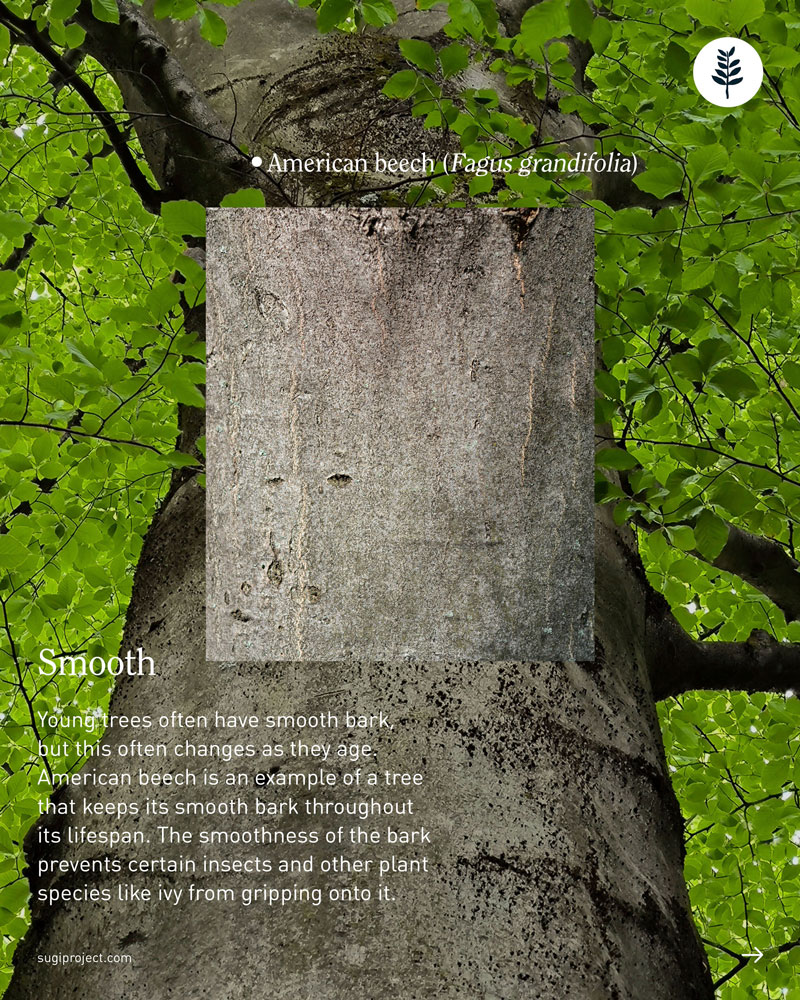
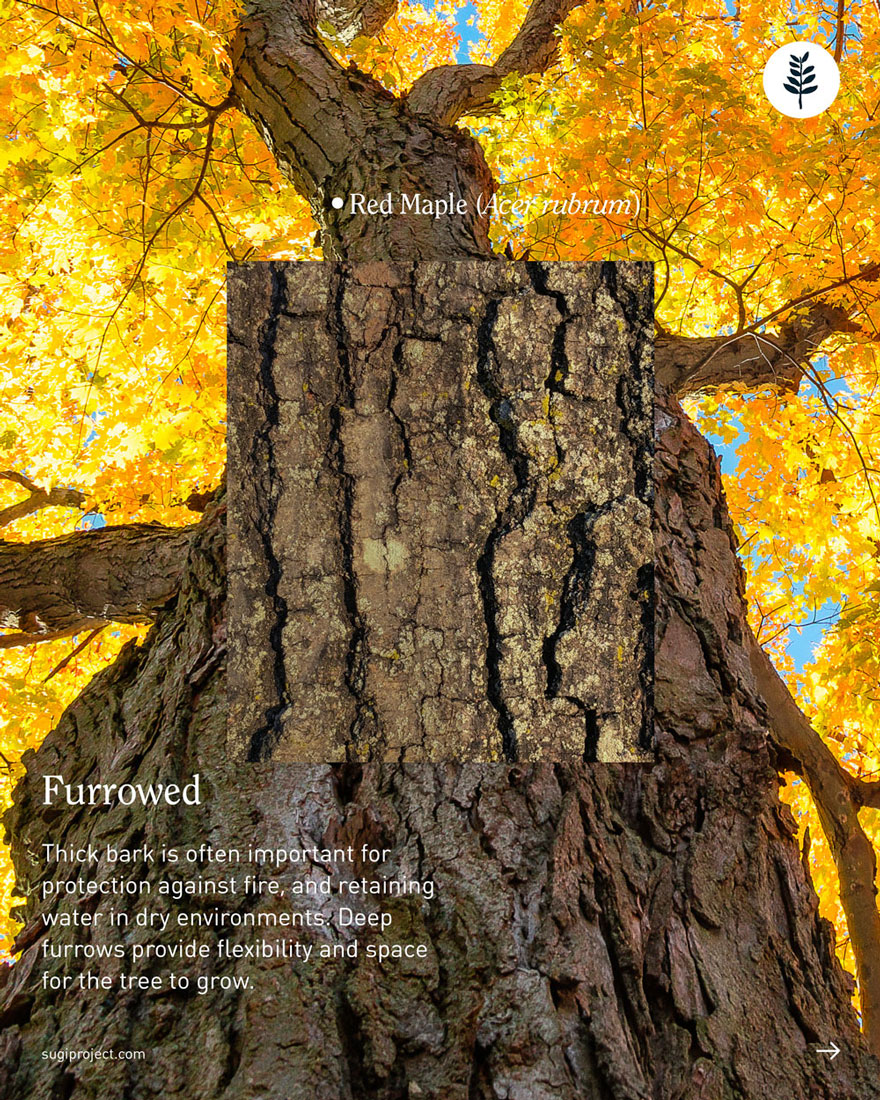
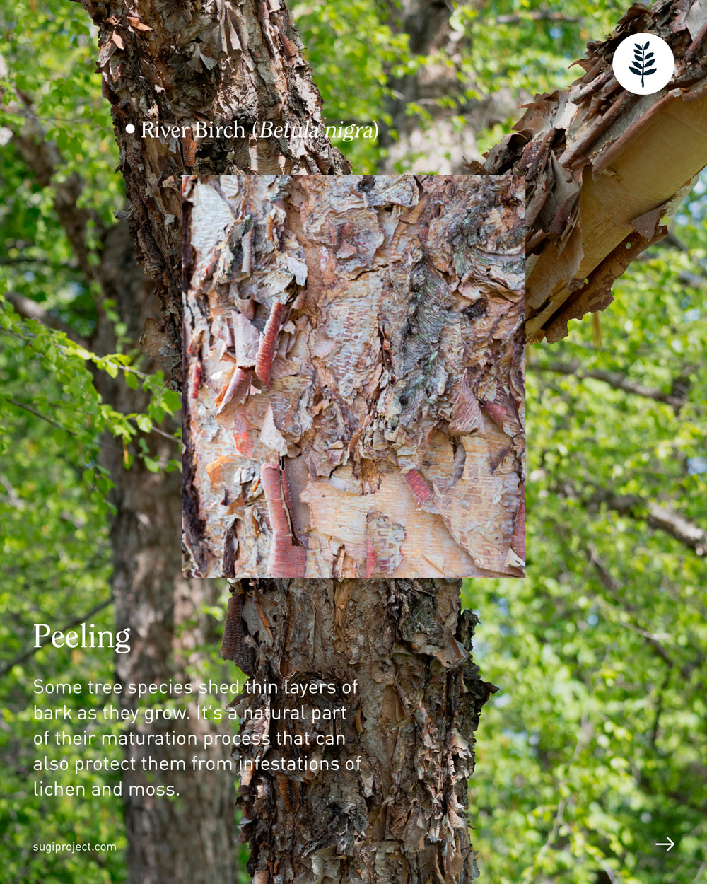
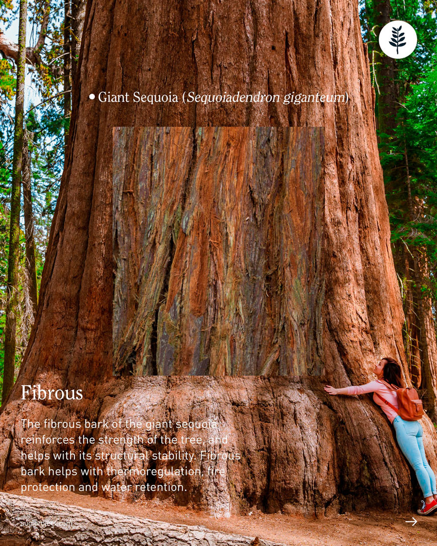

For this one in the series, the main challenge was sticking to the same visual language while working with something much more layered. Tree shapes and leaves lent themselves nicely to clean, geometric explanations, but bark is all about texture and detail, so photography became the hero. I kept the typography and overall layout consistent, and played with scale instead, pairing zoomed-in shots of the bark with wider images of the tree to show how those details fit into the bigger picture.
The SUGi Tree Guide: Bark
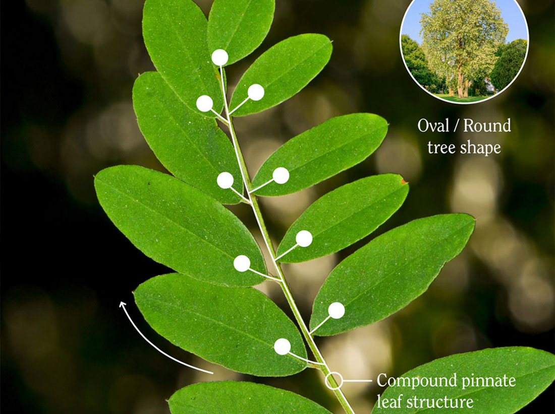
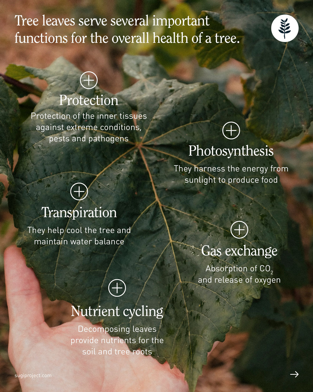
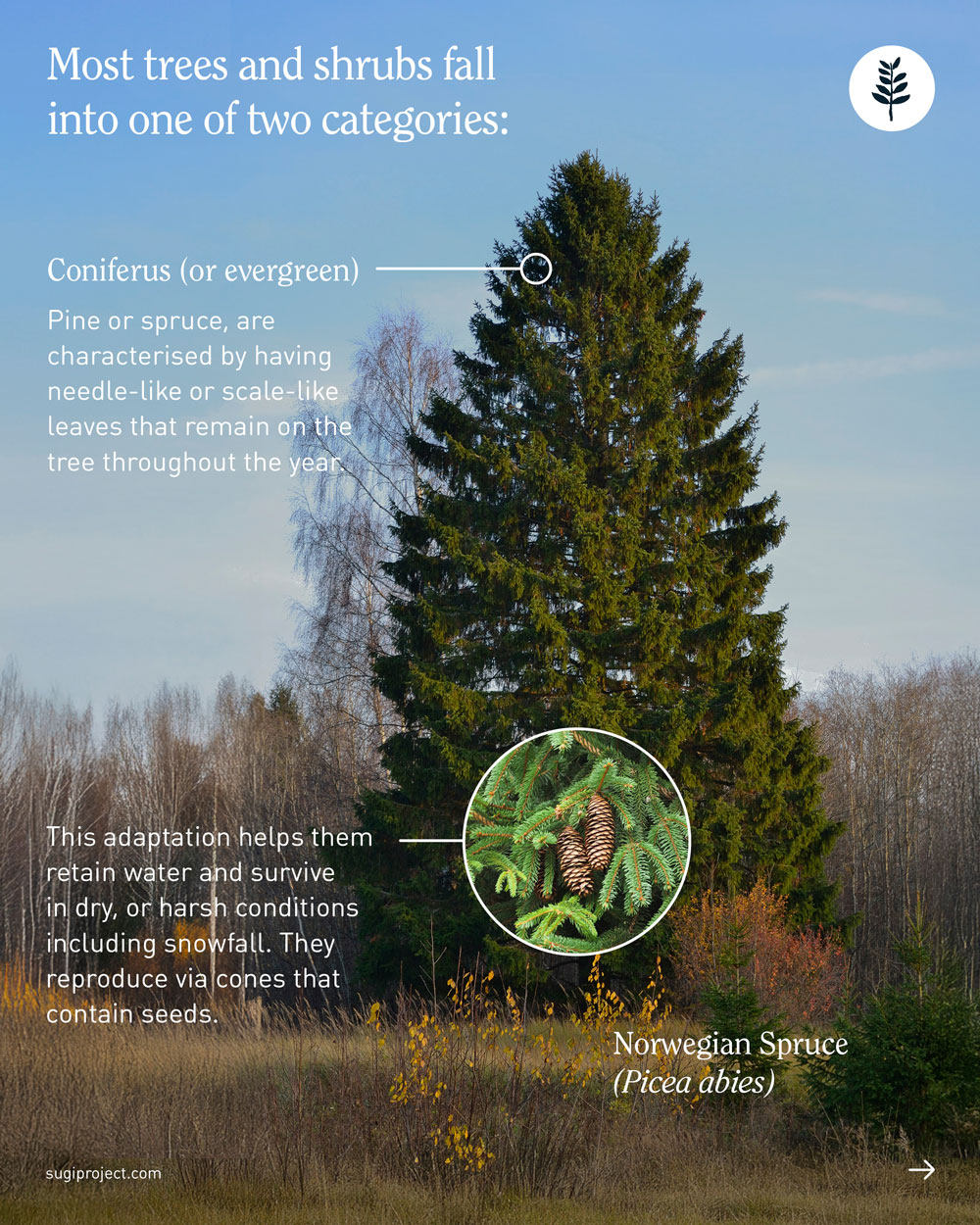
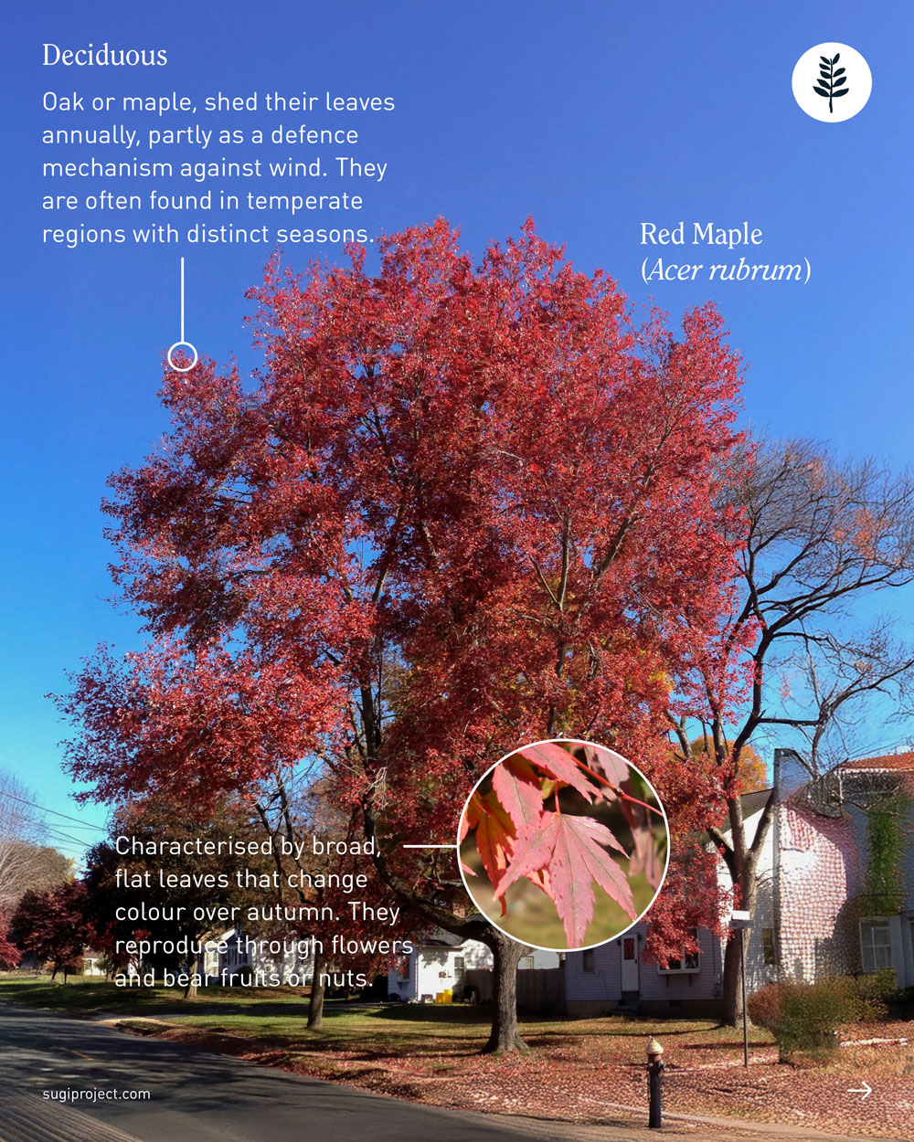
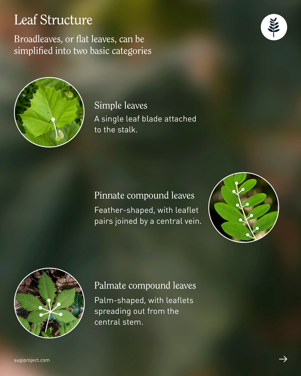
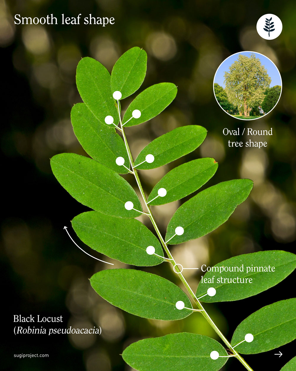
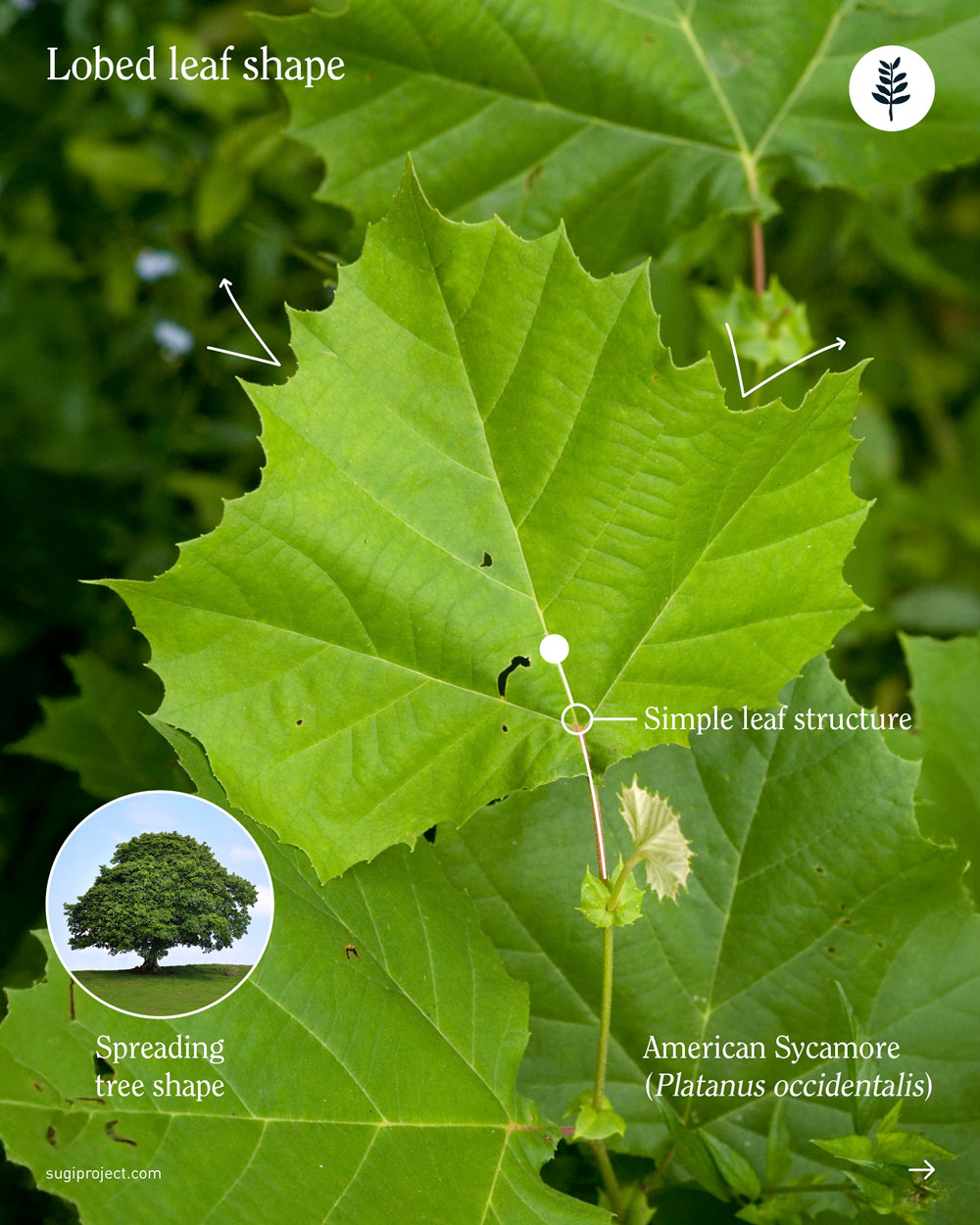
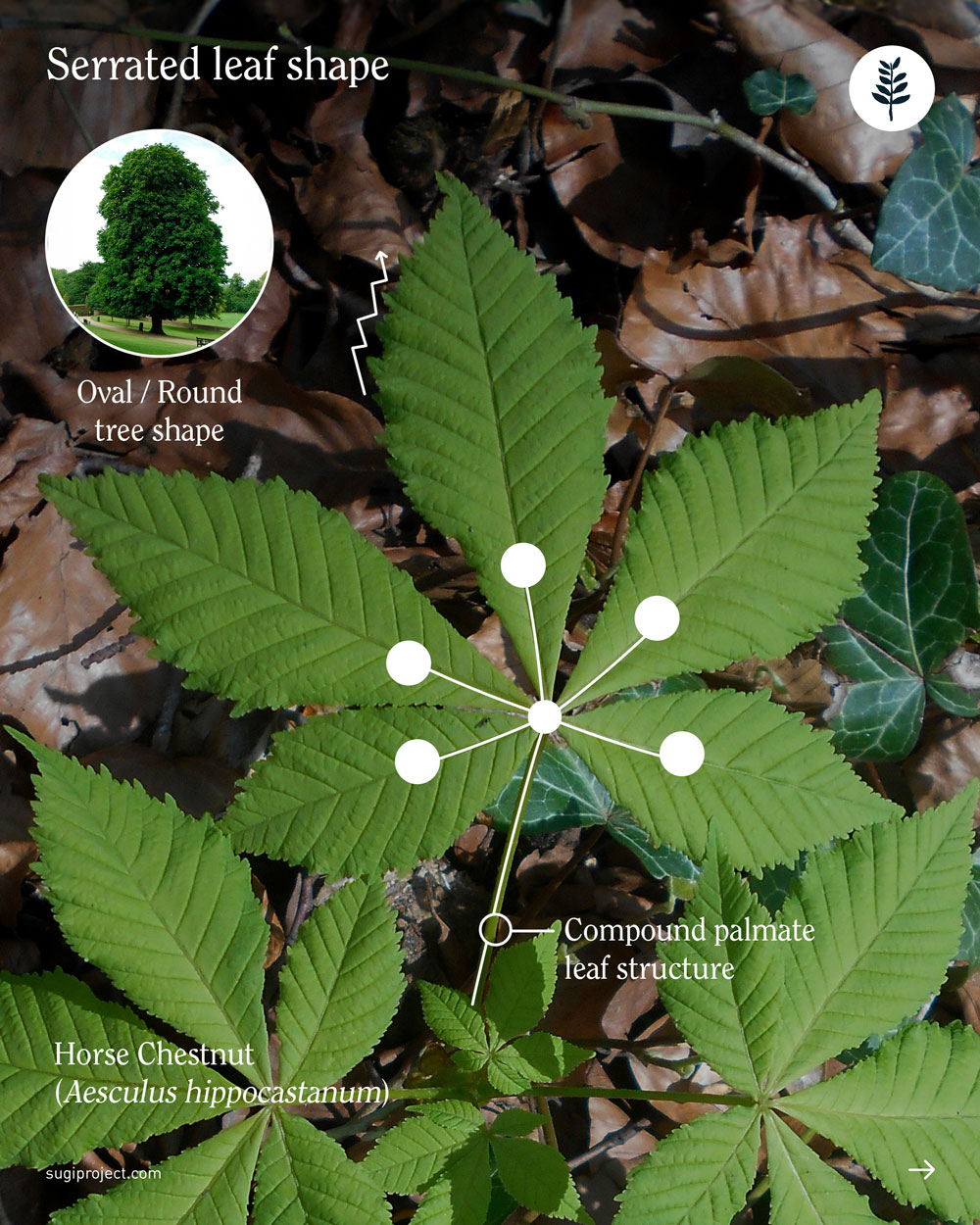
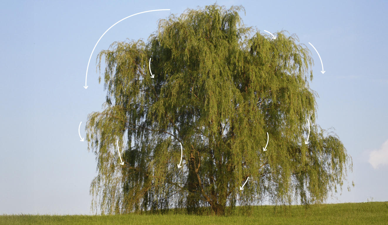
For the next piece in the series, I wanted it to clearly belong to the first one, but also push the system a little further. I reused some of the same imagery to keep that sense of continuity, and then built on it by adding simple design details, like minimal lines layered over the leaf photos, to help explain their shapes and structures in the same clear, intuitive way.
The SUGi Tree Guide: Leaves
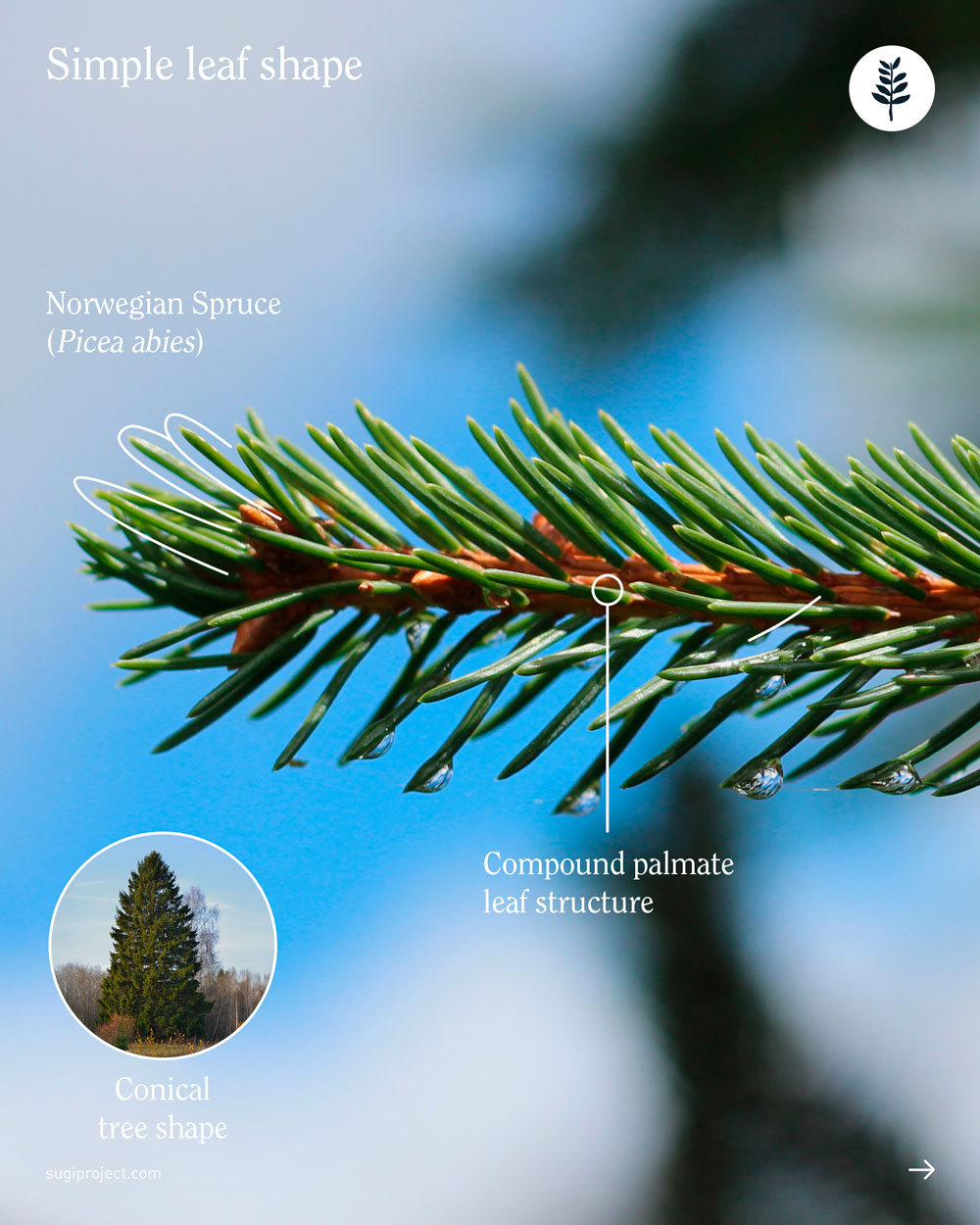
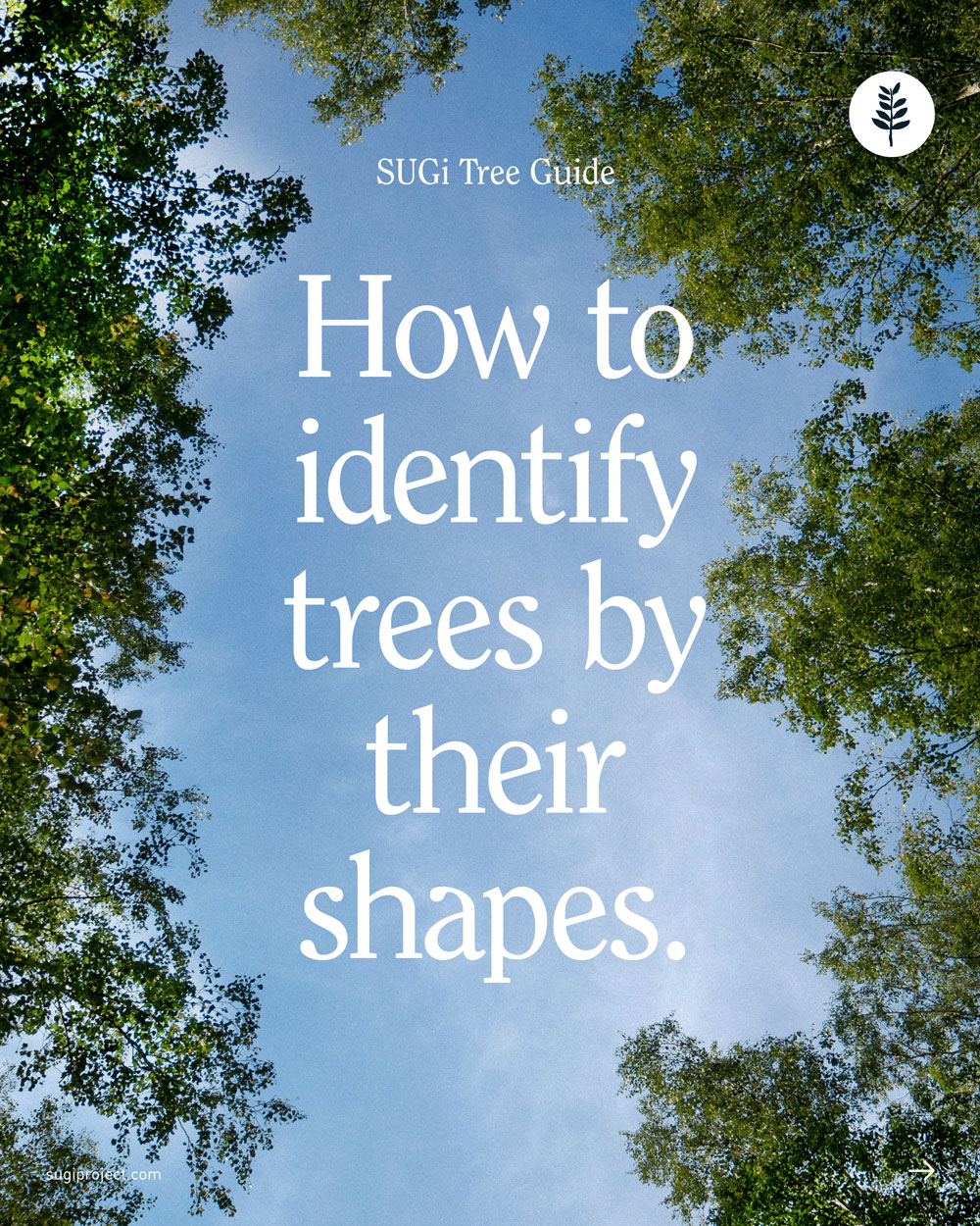
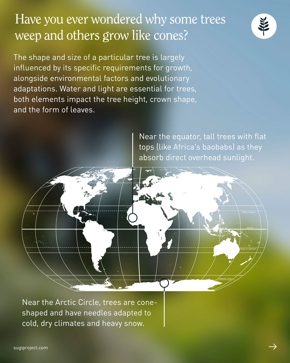
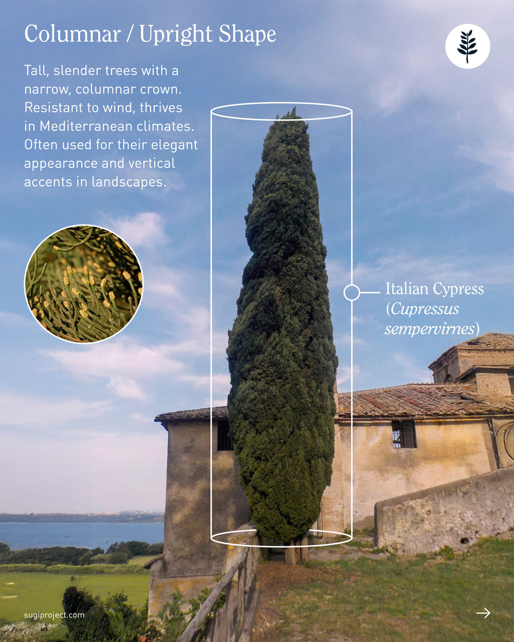
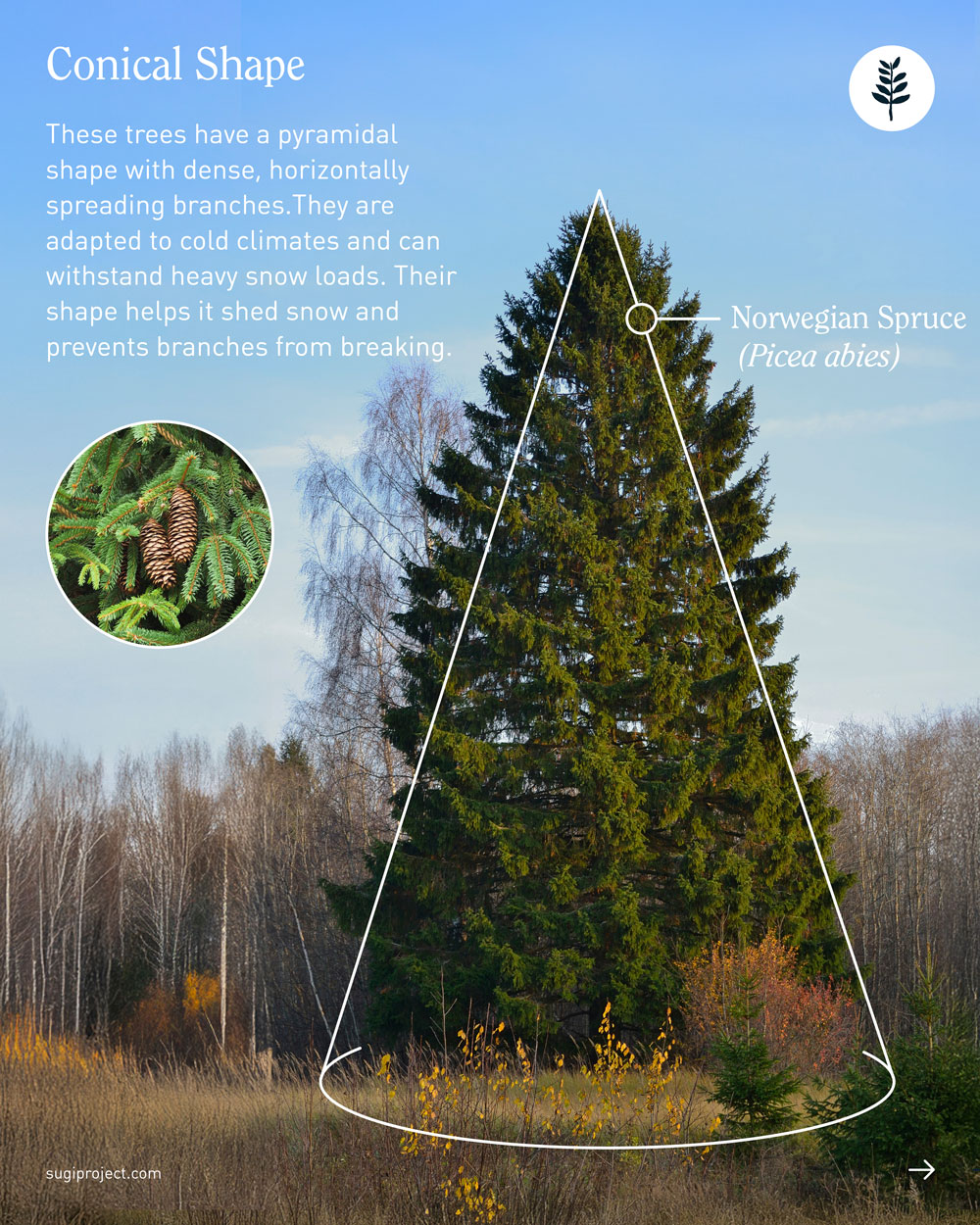
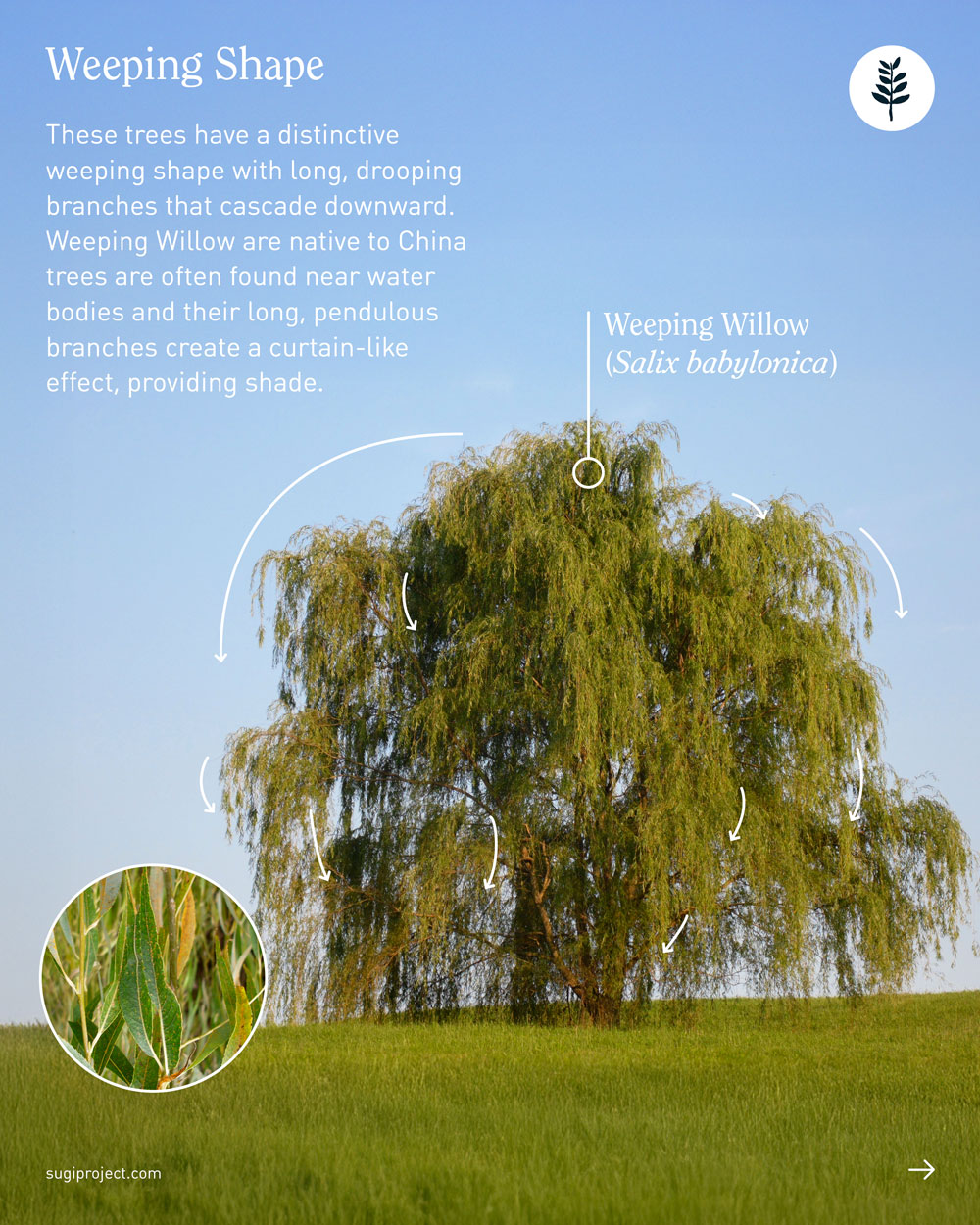
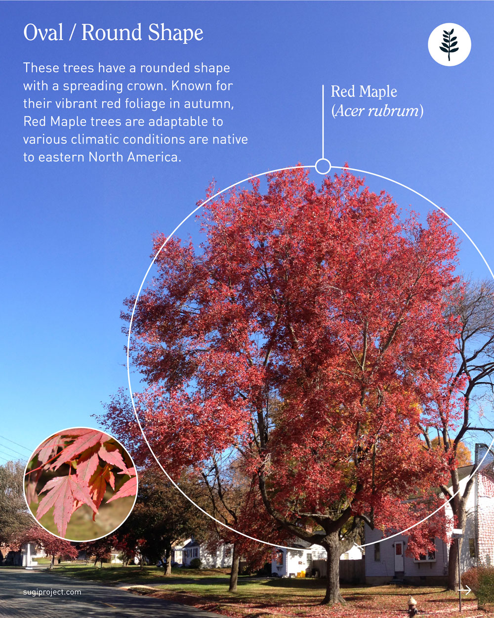
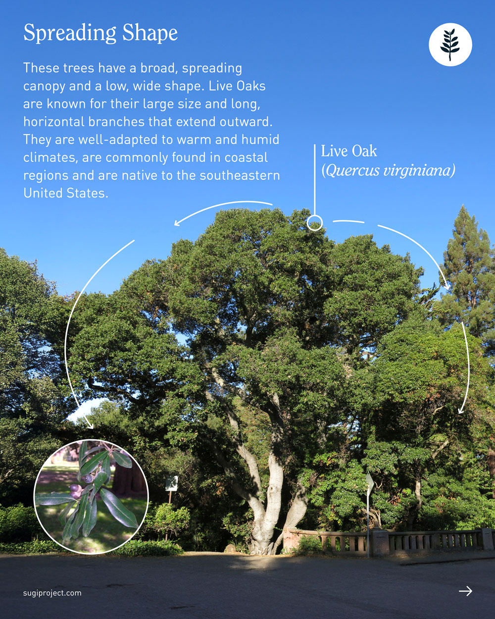
The SUGi Tree Guide: Tree Shapes
The SUGi Tree Guide: Tree Shapes
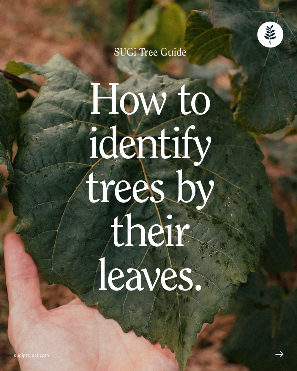
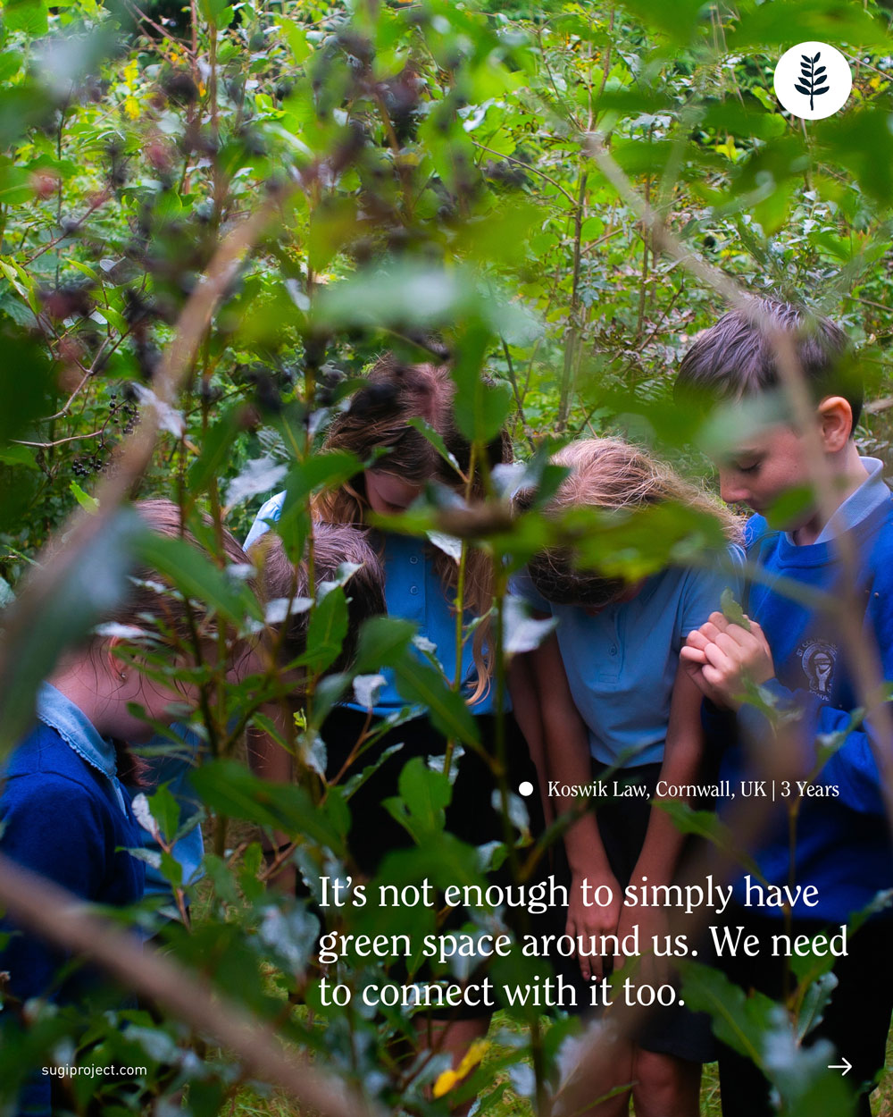
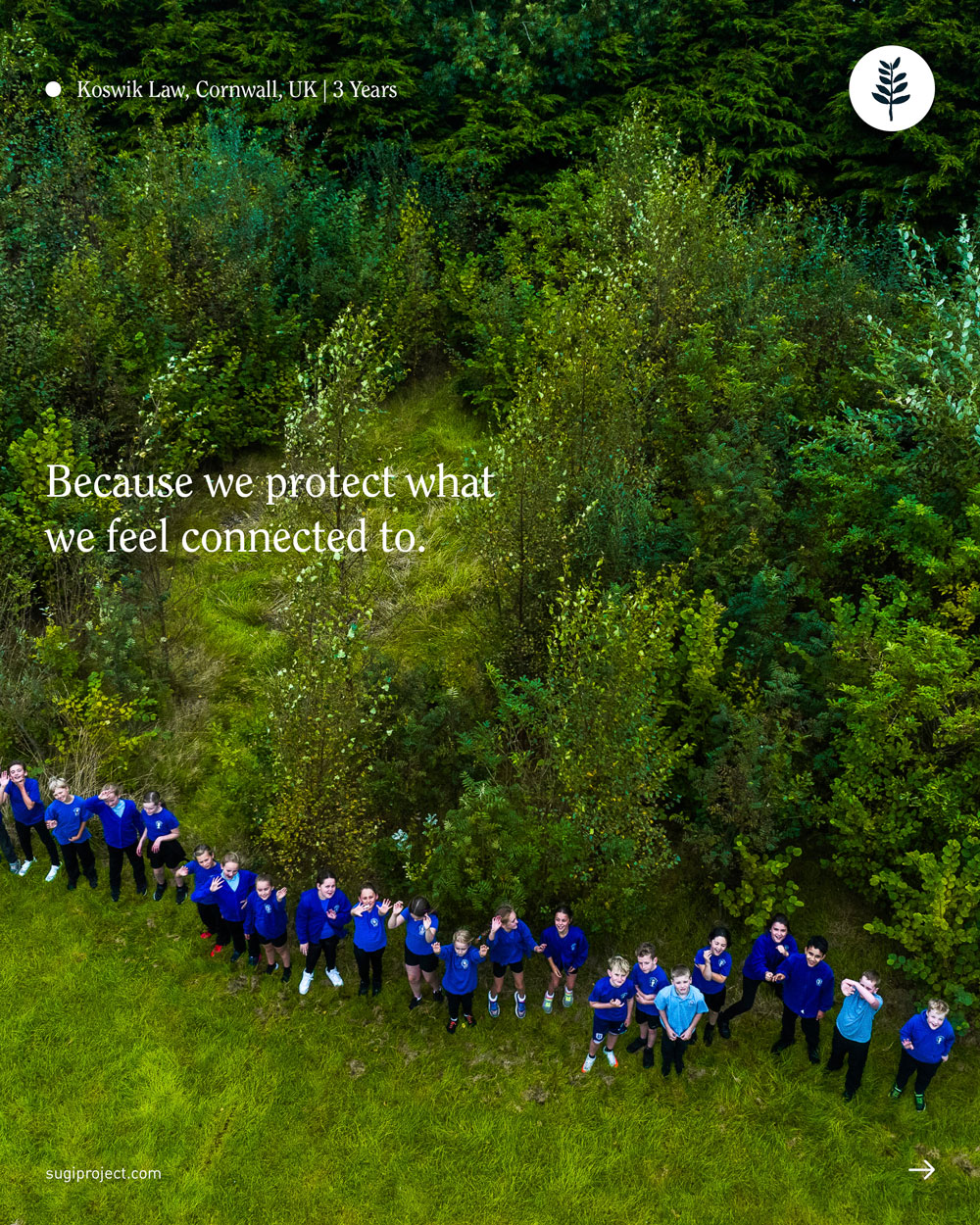
In a world where brand logos are often more recognisable than tree species, we wanted to slow people down and help them actually notice what’s around them. That’s how the "SUGi Tree Guide" series came to life, a simple way to help people identify trees using easy visual cues. I've designed 3 posts in this series: identifying trees by their shape, leaves and bark.
1.8m
Reach
39k
+2.5%
Engagement
New followers
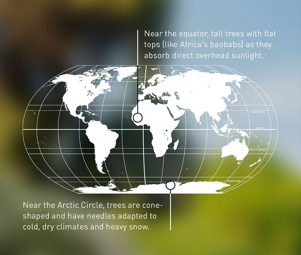
The first one in the series is identifying trees by their shapes. The main challenge was building a design system that could hold a lot of information without feeling overwhelming, while staying consistent and accessible across the whole series. I landed on a clean, minimal approach using lines and circles to guide the eye, real-life photography instead of illustrations, and short, clear captions that made the content easy to scan and understand.
For the cover, I played with a sense of motion, like the viewer is passing by and not fully noticing the world around them, taking it for granted, forgetting it’s there. I kept the text simple and clean, with a fading gradient that followed the direction of the movement, reinforcing the theme of disappearance. Inside, the post moves from an old photograph to more modern images and styling, with the third one mirroring the cover’s motion in a rushed city scene.


New followers
Engagement
+1%
94k
Reach
1.1m
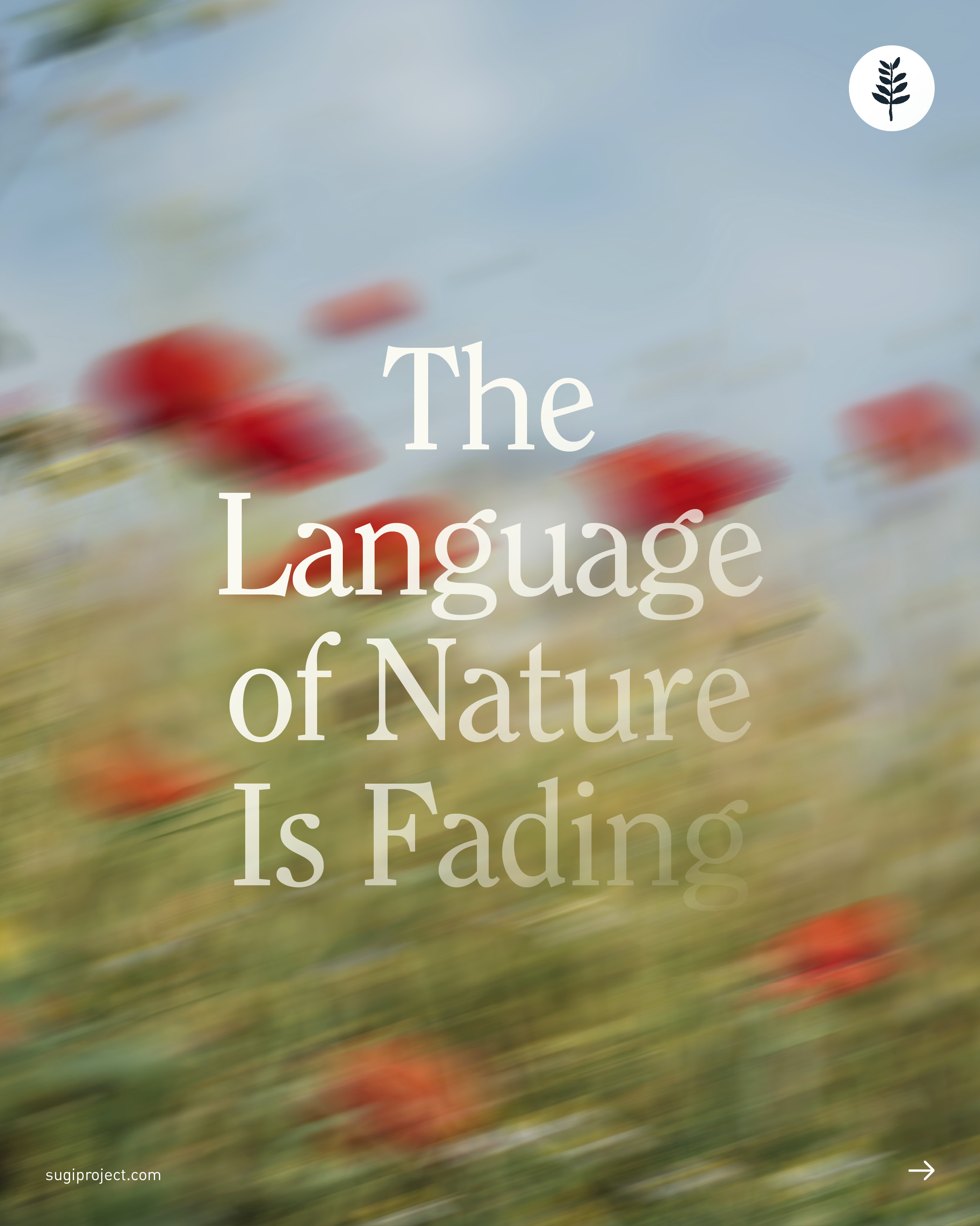
The idea behind this post was to capture the feeling of a language slowly fading; a language that has been part of people’s lives for thousands of years, but is at risk of being forgotten. I approached this design quite literally, focusing on the idea of fading and how that looks visually.
The Language of Nature is Fading
G
T
I
N
I
E
D
I
V
D
E
O
scope: motion graphics, sound editing, grading
The Bridging Forest

scope: animation, motion graphics, graphic desgin

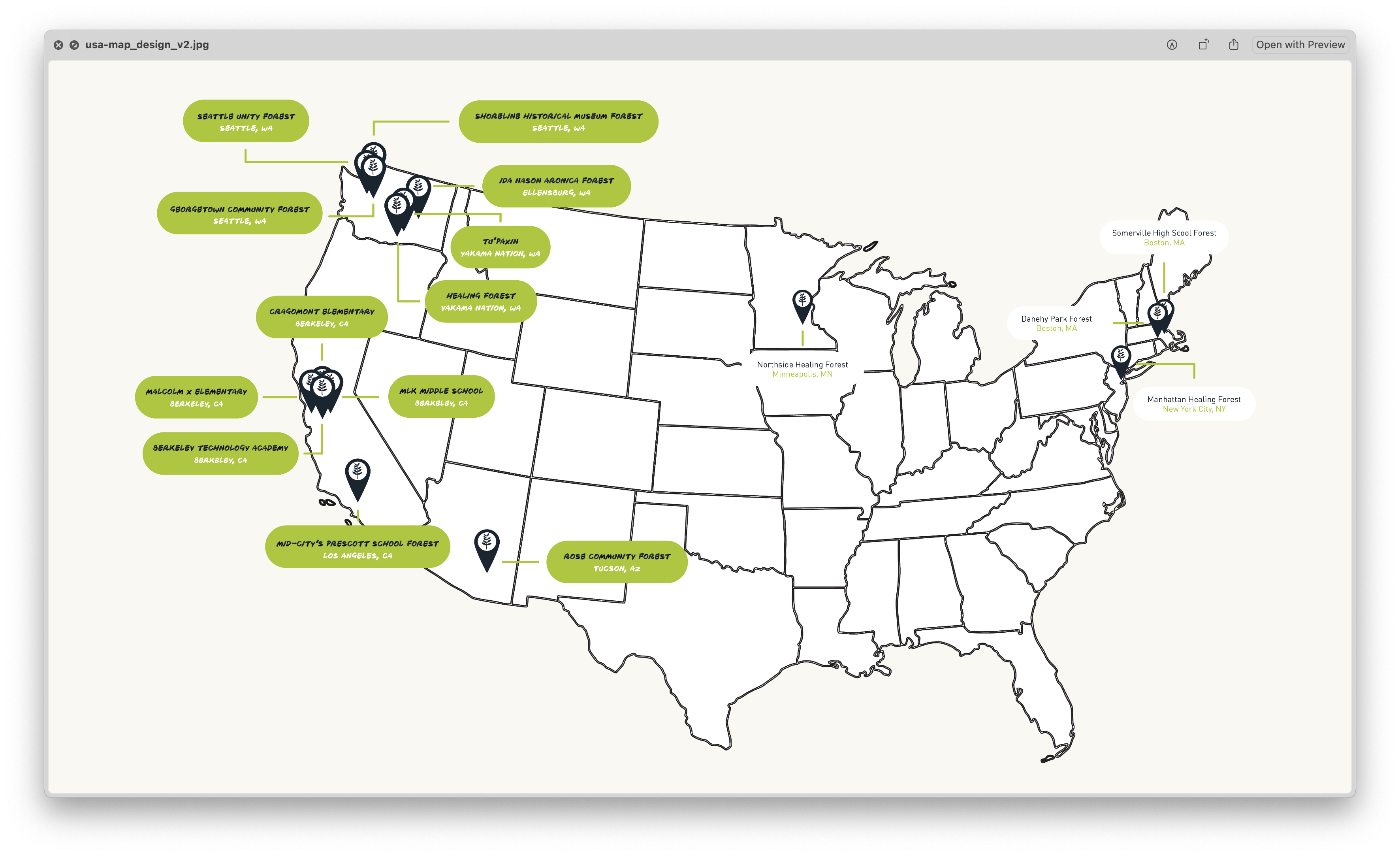
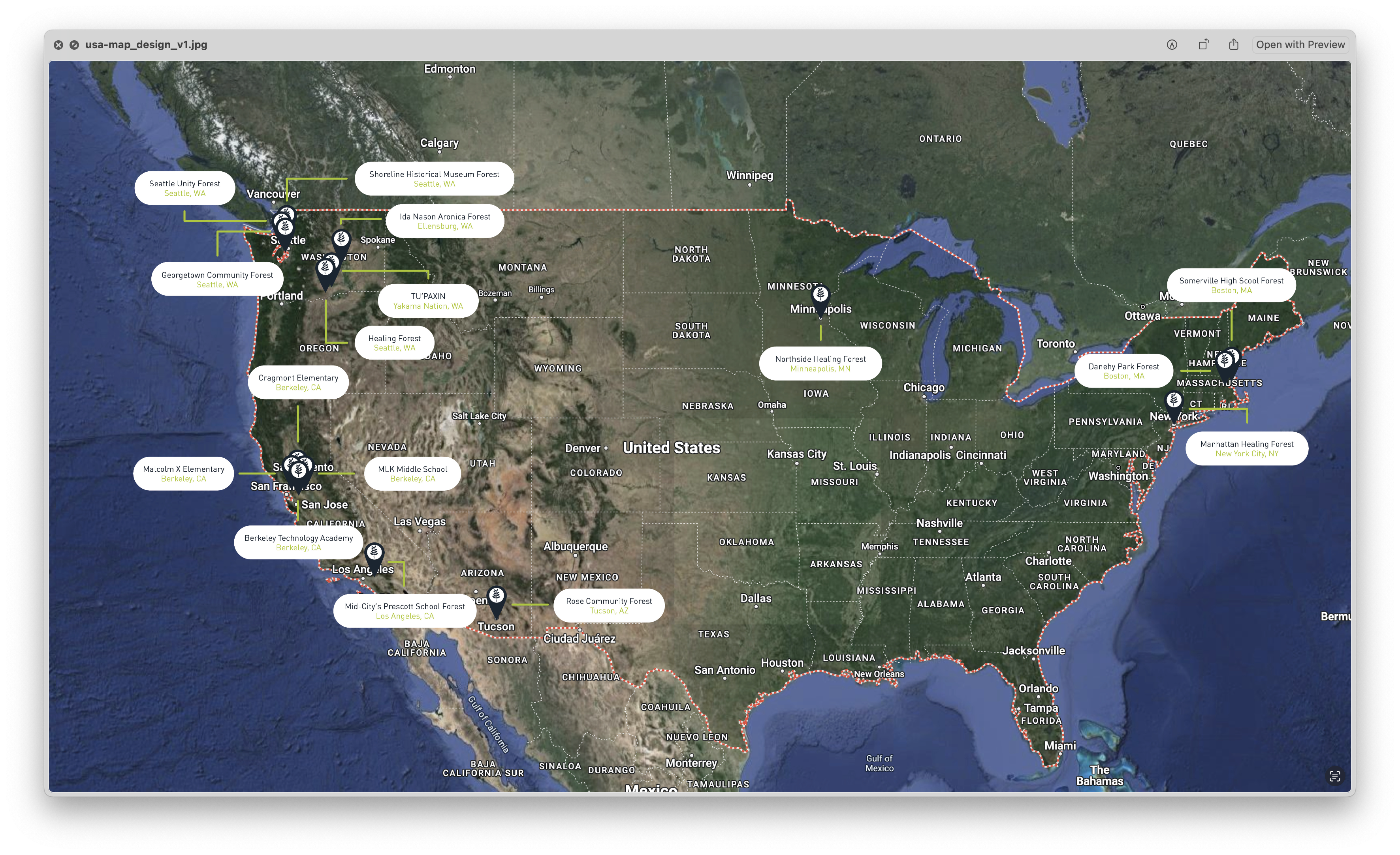
3. Healing Forest Short Film: Map
Finally, the last section to be animated in the film highlighted SUGi’s projects across the United States. We needed an animation that would immediately convey the scope of our work.
I started off with a Google maps-style design and versions that included detailed names, locations, and realistic textures, but they felt too heavy and distracting. I stripped it all back a complex, into something clean and minimal, a line-drawn US map, with the states where SUGi has projects lighting up as stats gently appeared. Simplifying it gave the animation clarity and flow, while the same “bleeding in” effect tied it back to the rest of the film’s rhythm.
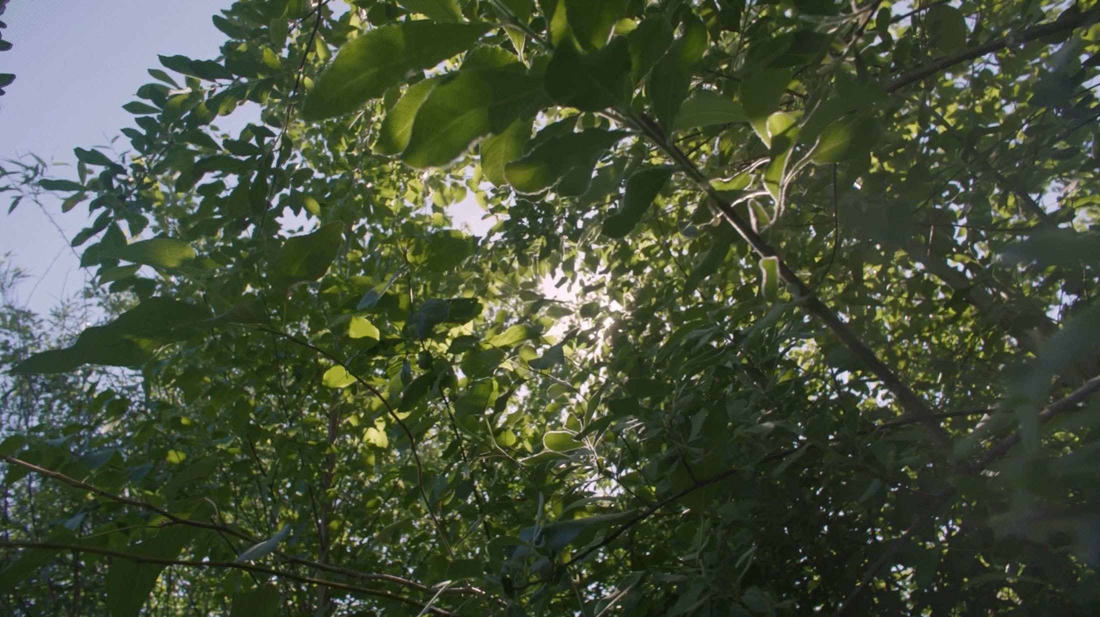
The video features a section that show the forest design. The challenge was to make a static sketch feel alive. After trying more technical, clean-lined versions and complex layouts that included drone footage and text overlays, I landed on an organic, hand-drawn style with a “bleeding in” animation that made the forest appear to grow in real time. A simple off-white background allowed it all to breathe, keeping the focus on the story.
2. Healing Forest Short Film: Forest Design
For the title sequence, I designed an animation where the English and Indigenous translations of “Healing Forest” flowed seamlessly into one another, synchronized with the audio. It became a visual metaphor for unity between language, culture, and nature. I used the same text animation for the rest of the title sequences and credits in the rest of the film.
1. Healing Forest Short Film: Text Animation
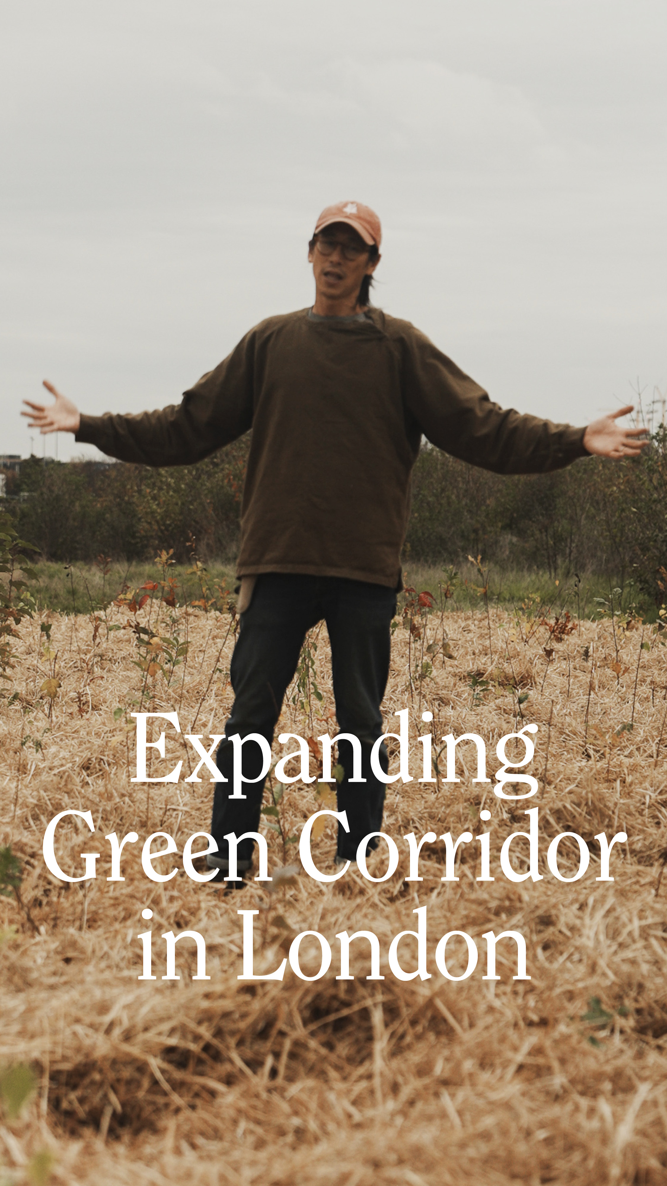
For social media, the first few seconds matter most, so the big question was: what’s the hook? After exploring a few angles (focusing on plant species or leading with a strong scientific fact) I landed on the clearest and most compelling story: where we are, why this space exists, and why it’s called the Bridging Forest.
Finding the right tone was another challenge. The footage felt relaxed and informal, so I leaned into that energy. I used quick, hard cuts between forest shots and interview moments, kept some of the more natural, unscripted lines in, and layered in text and subtle sound effects where needed, just enough to keep the pace up without losing that easy, conversational feel.
The brief for this video was to create a reel that tells the story of a London pocket forest we’ve planted in between 2 already existing ones. We filmed our forest maker talking us through the project.
Healing Forest Short Film
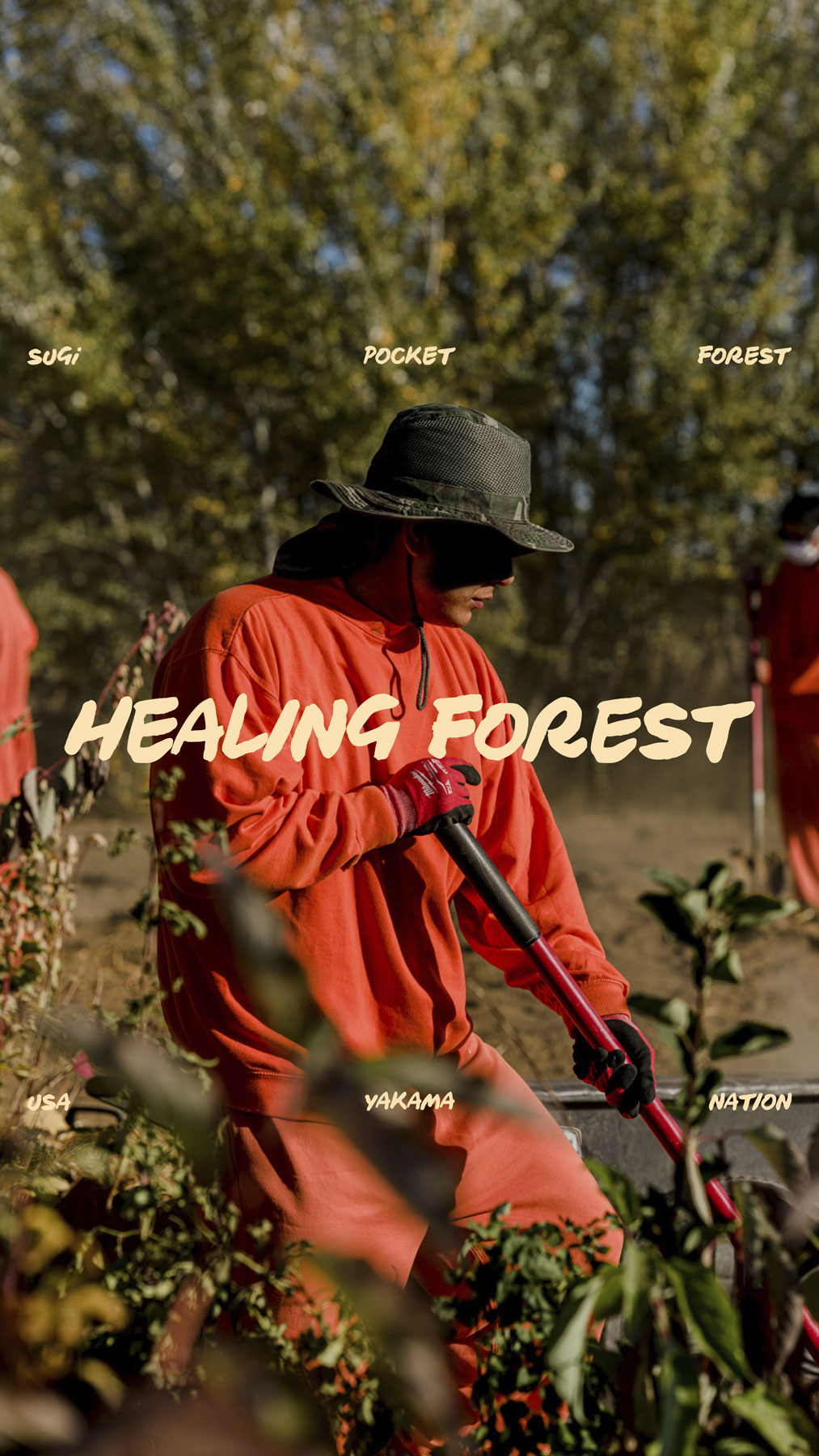
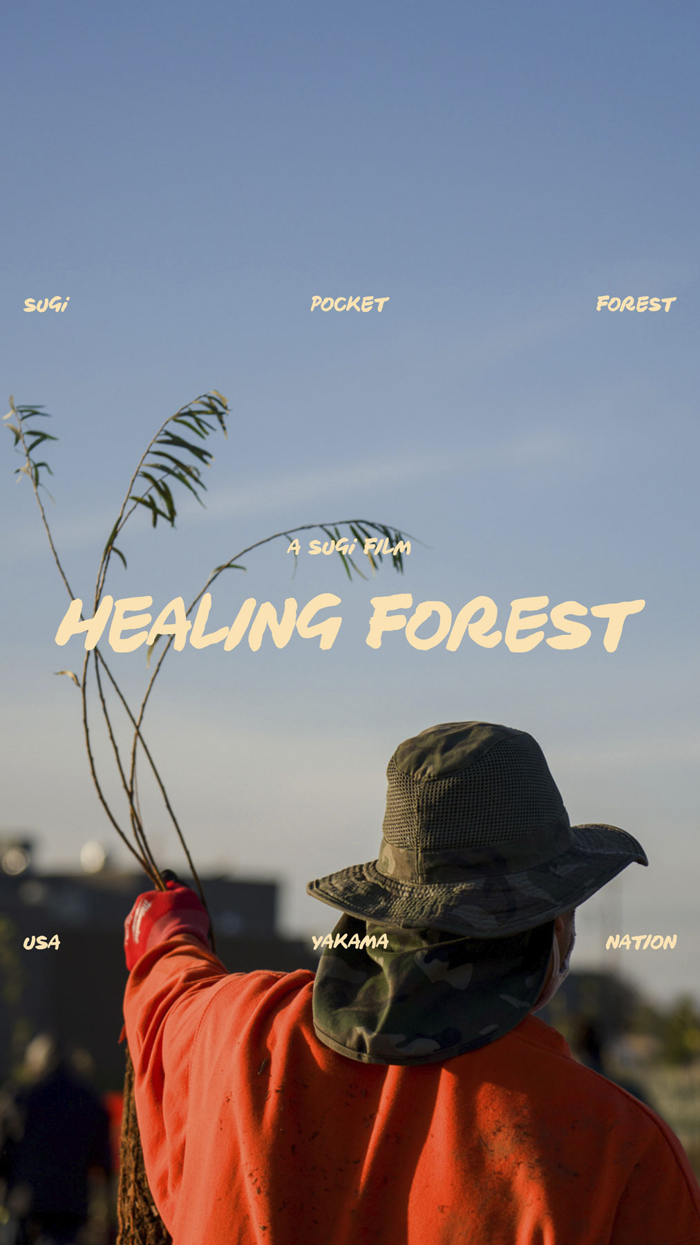
Healing Forest, SUGi’s first short film, tells the story of the Yakama Nation and the deep connection between the people and the land. My role was to create animations for the video that would seamlessly blend into the story and edited film.
I experimented with several layouts, using SUGi illustrations to show both the planting process and the end result and exploring different levels of detail. In the end, I went with a simple, clean approach: a clear illustration, the essential information front and center, and the partners’ logos, making it approachable, easy to read, and visually engaging.
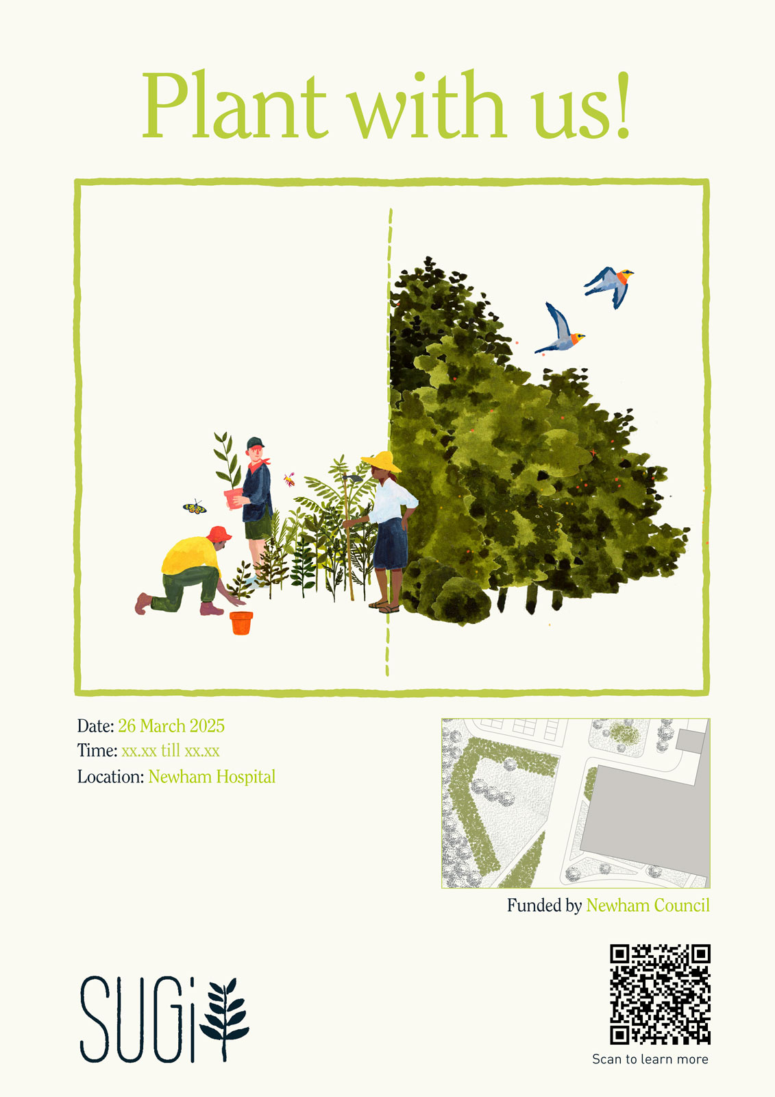
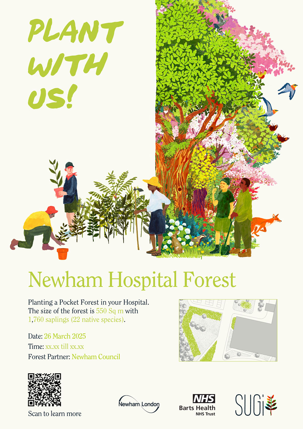
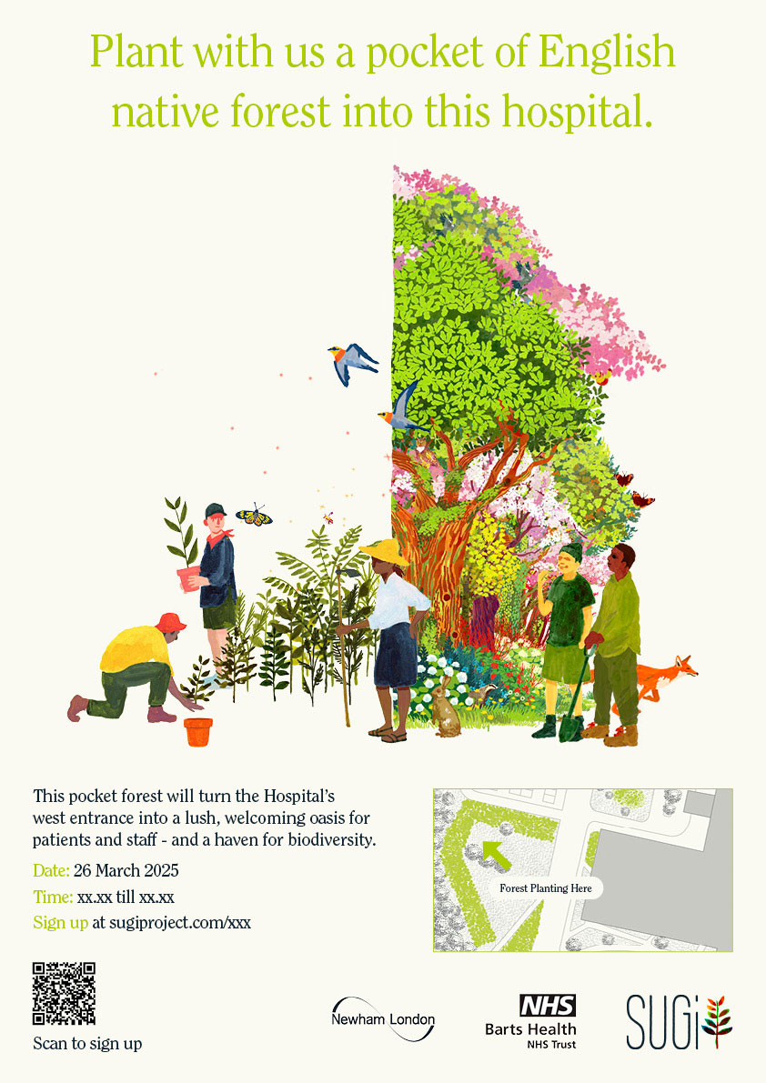

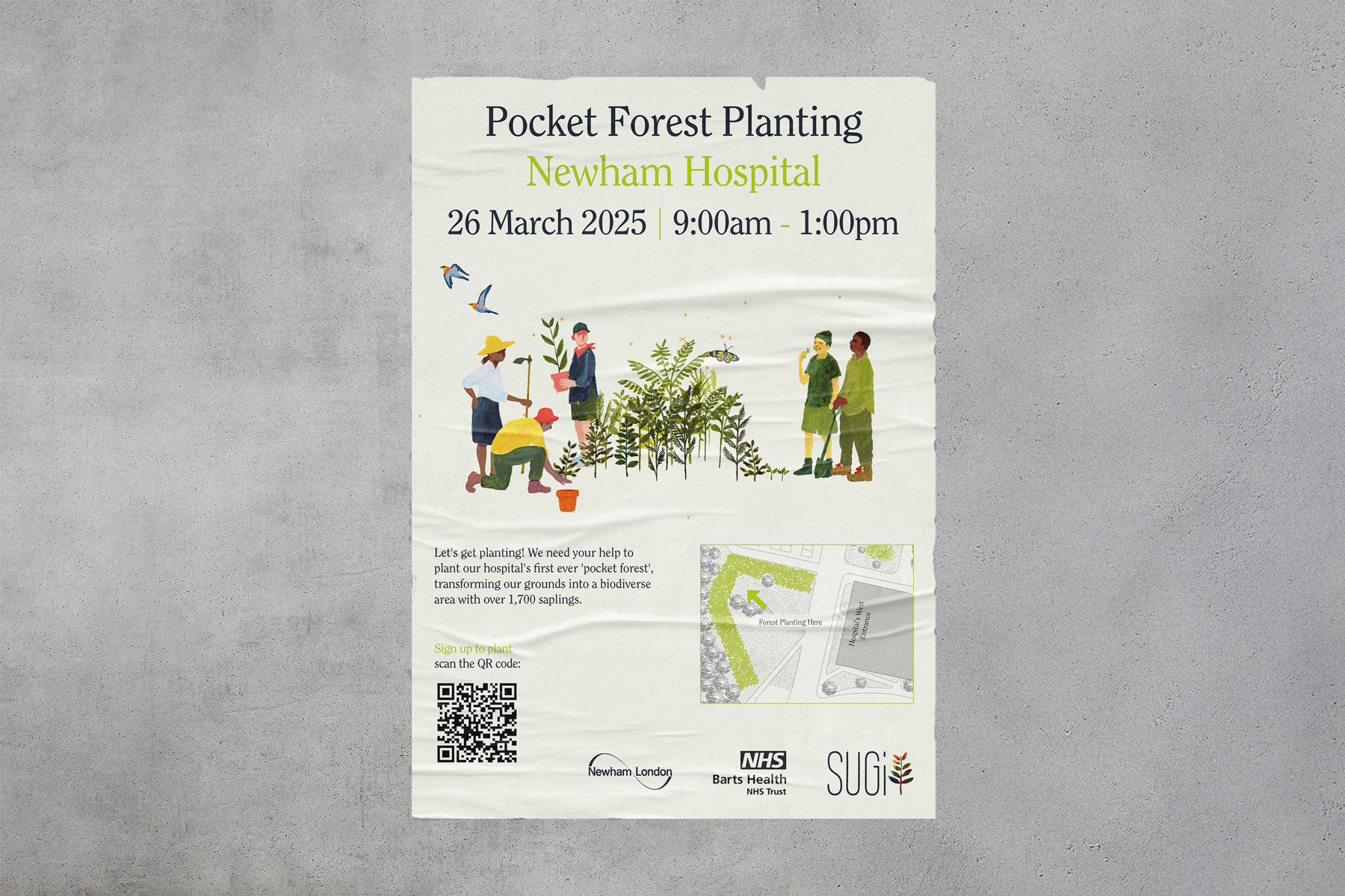
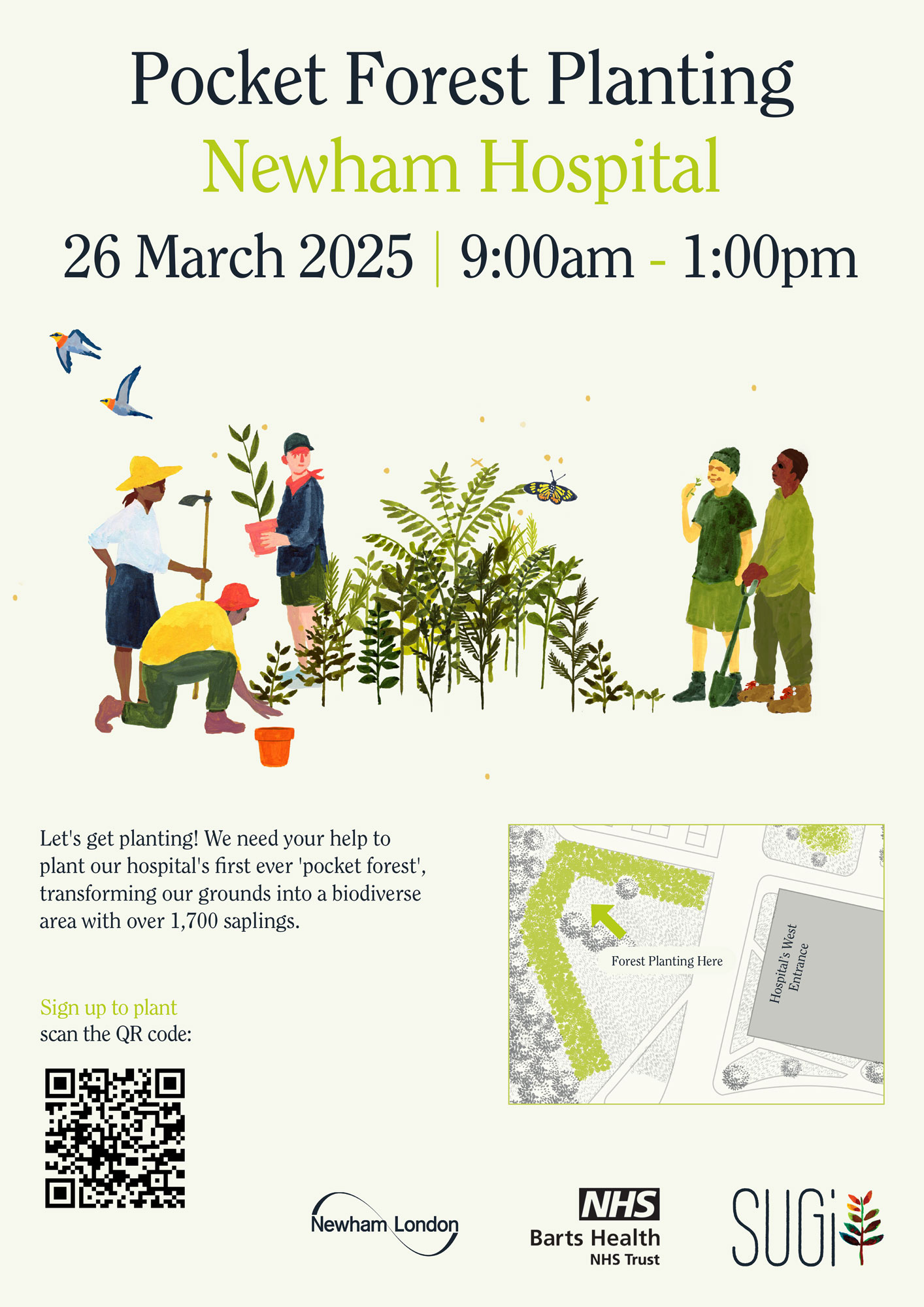
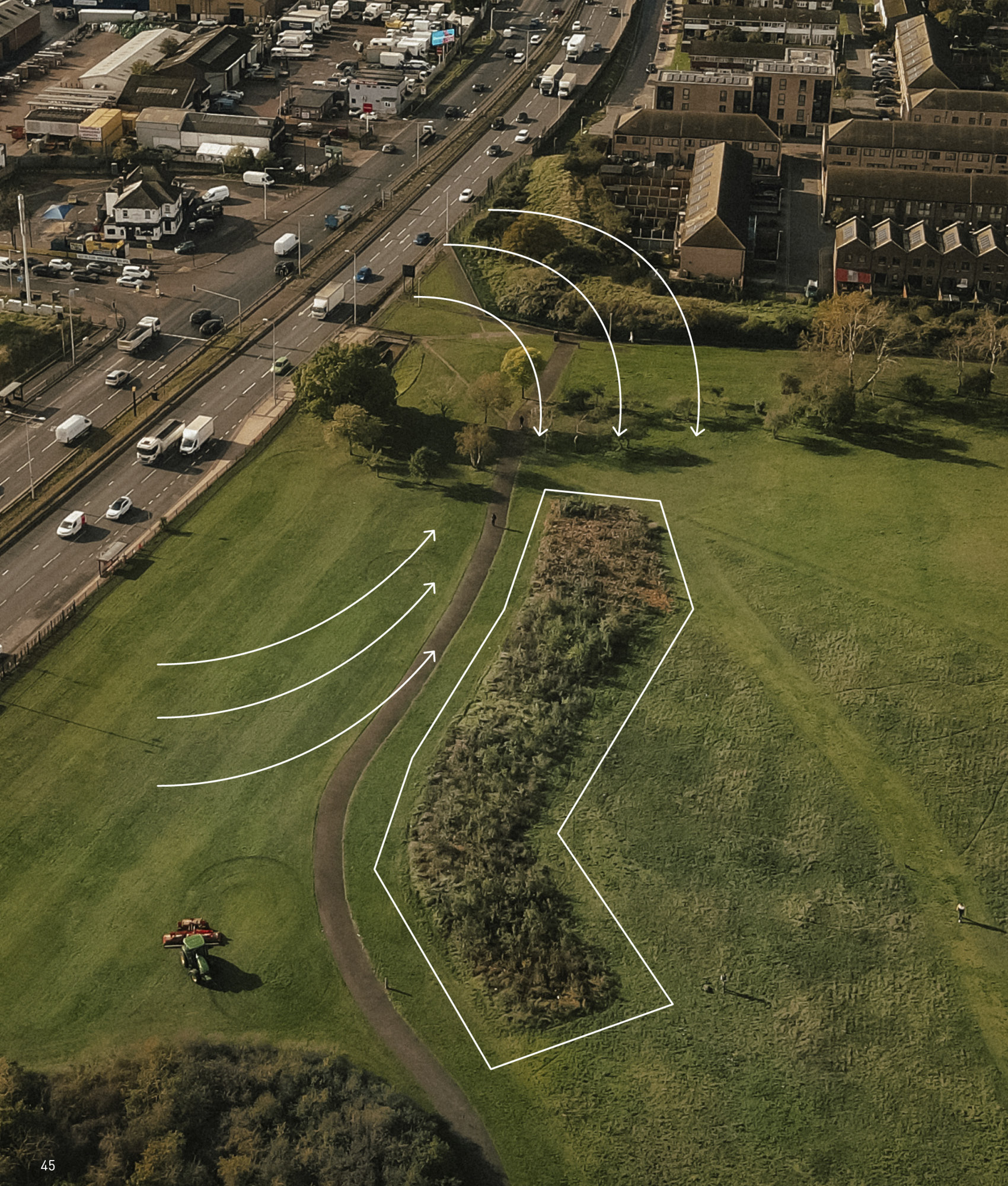
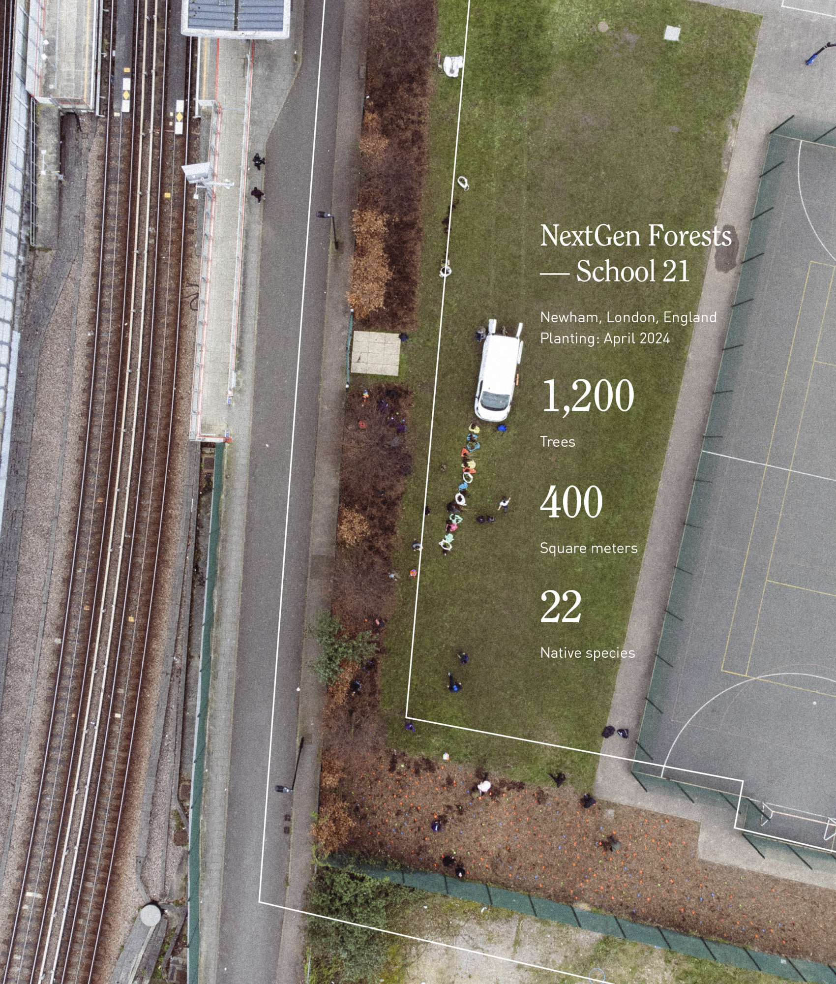
We needed a poster for a pocket forest planting at a hospital in London that would be displayed within the hospital grounds. The goal was to create something in the SUGi style that would catch attention, spark curiosity, and clearly convey the essential details: time, place, purpose, and partners.
I experimented with several layouts, using SUGi illustrations to show both the planting process and the end result and exploring different levels of detail. In the end, I went with a simple, clean approach: a clear illustration, the essential information front and center, and the partners’ logos, making it approachable, easy to read, and visually engaging.
I experimented with several layouts, using SUGi illustrations to show both the planting process and the end result and exploring different levels of detail. In the end, I went with a simple, clean approach: a clear illustration, the essential information front and center, and the partners’ logos, making it approachable, easy to read, and visually engaging.
Newham Hospital Planting
G
N
P
E
I
I
D
C
S
H
A
R
G
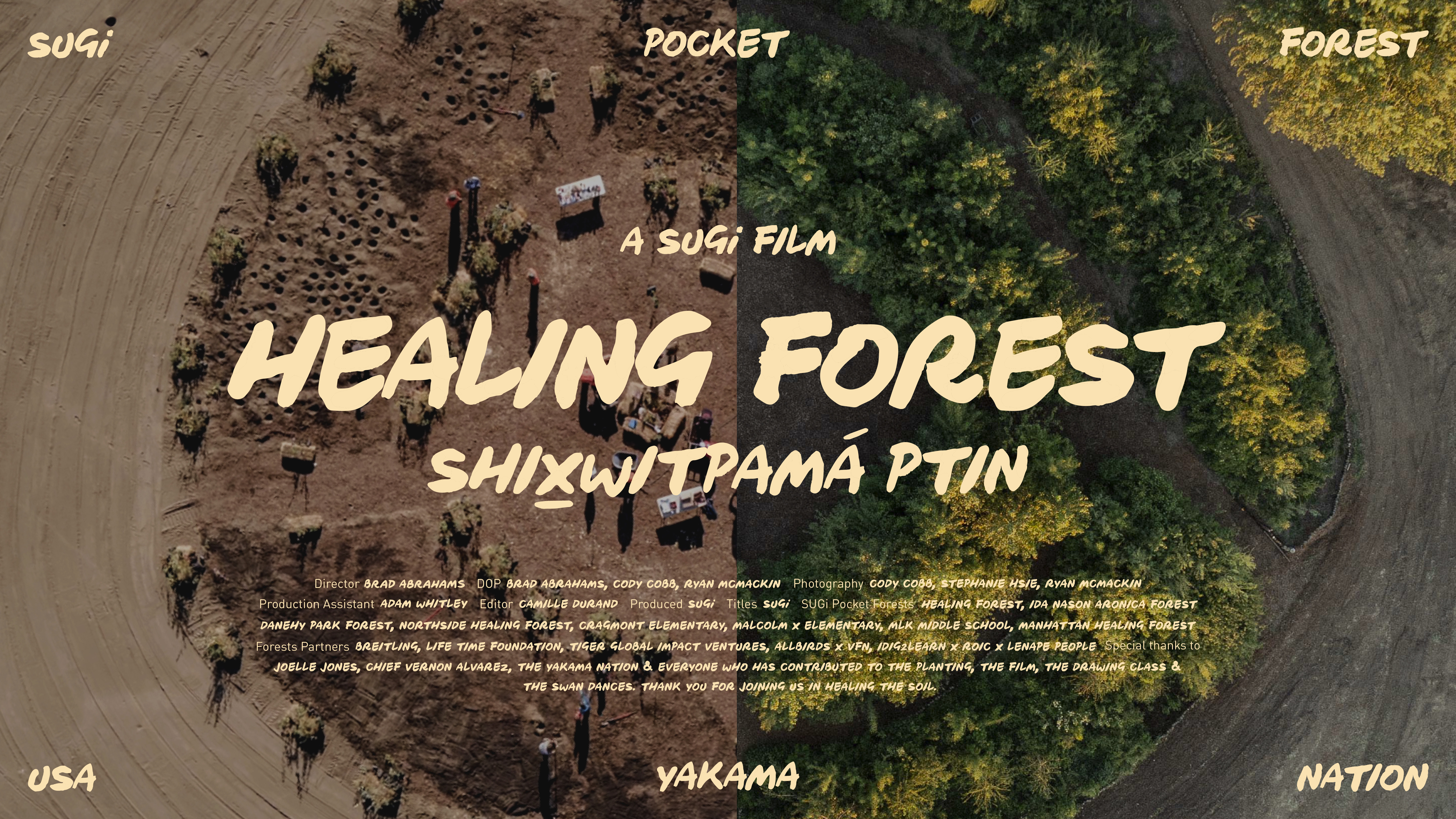
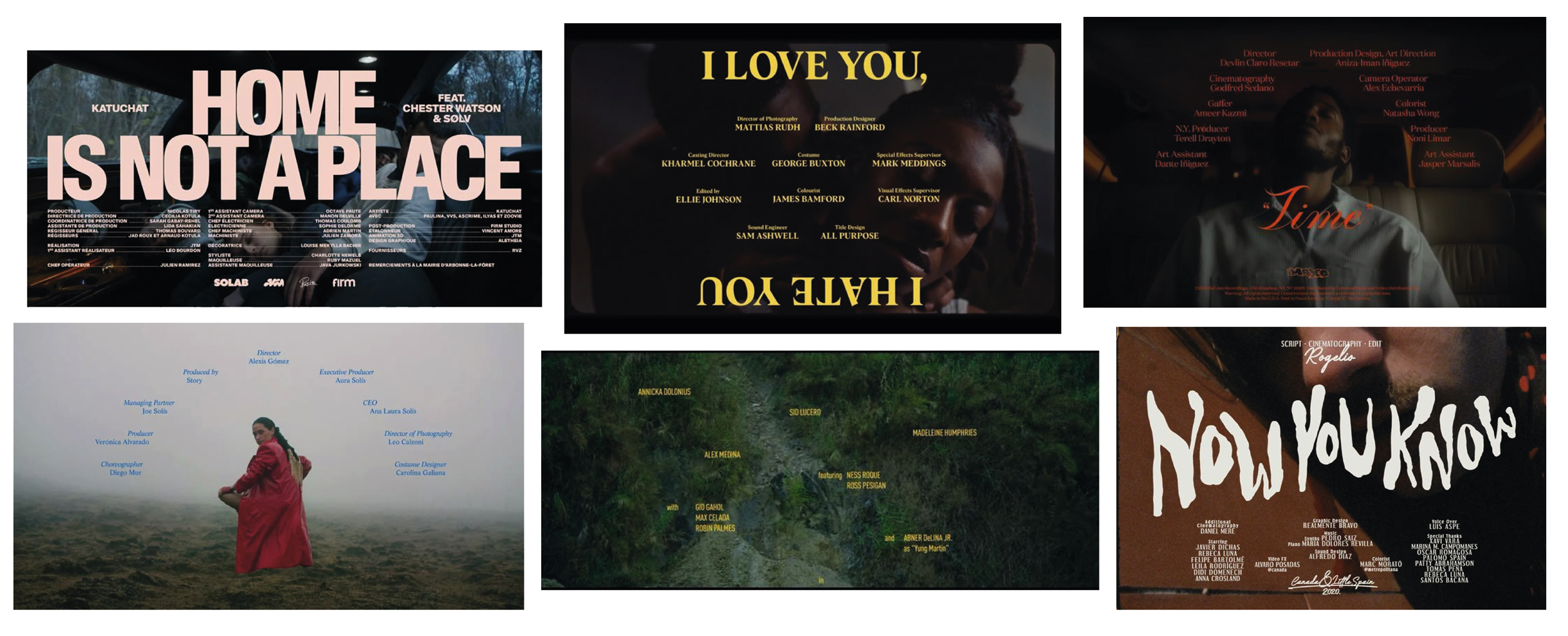
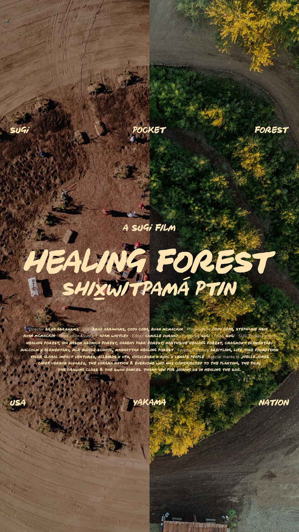
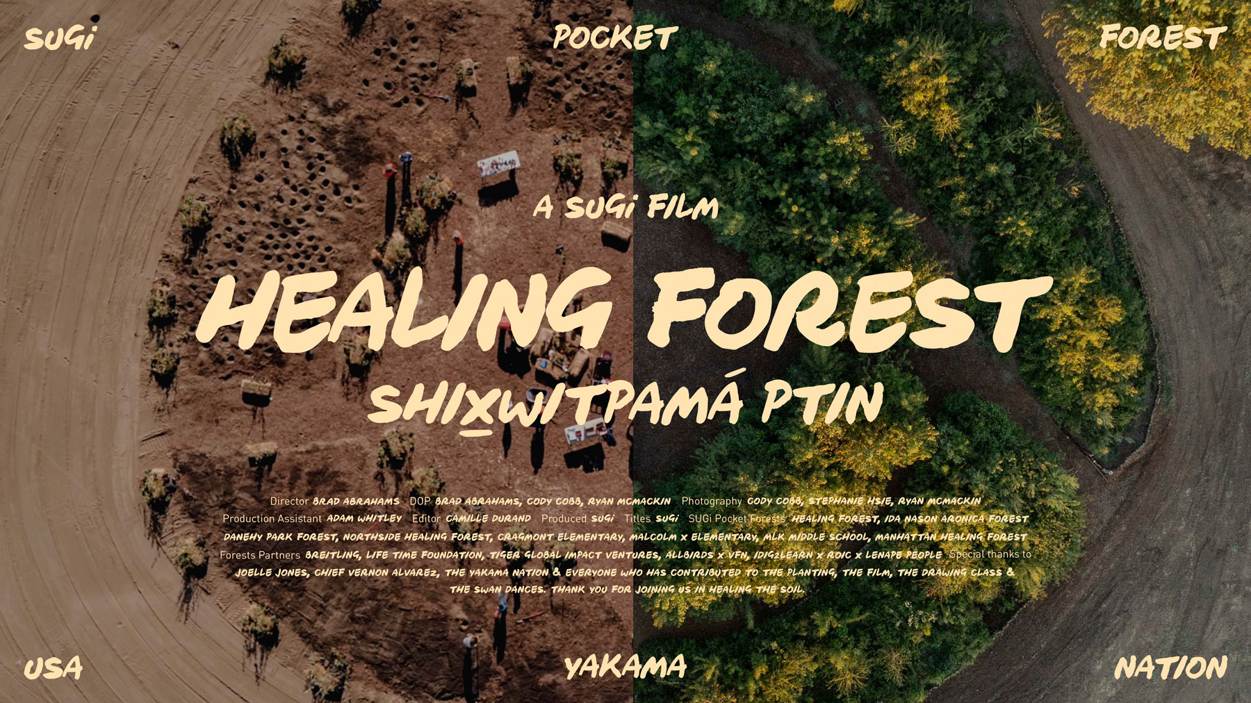
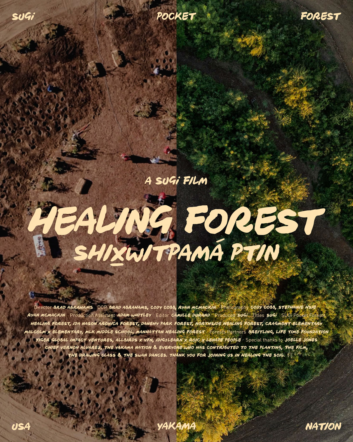
After digging into references and exploring different visual directions, I designed a layout that pulled from the film’s title sequence and included the credits, giving it that authentic movie-poster feel. Once the final design was set, I reformatted it and created variations for social platforms (Instagram, LinkedIn and YouTube).
After digging into references and exploring different visual directions, I designed a layout that pulled from the film’s title sequence and included the credits, giving it that authentic movie-poster feel. Once the final design was set, I reformatted it and created variations for social platforms (Instagram, LinkedIn and YouTube).
Healing Forest Short Film Poster
Healing Forest, SUGi’s first short film, tells the story of the Yakama Nation and the deep connection between people and the land. To accompany the film, we needed a poster that would do more than just promote it, it had to capture its soul. The poster needed to work both as a standalone visual piece and as a cover for social media, so it had to feel cinematic yet adaptable.
E
I
N
D
S
G
B
E
W
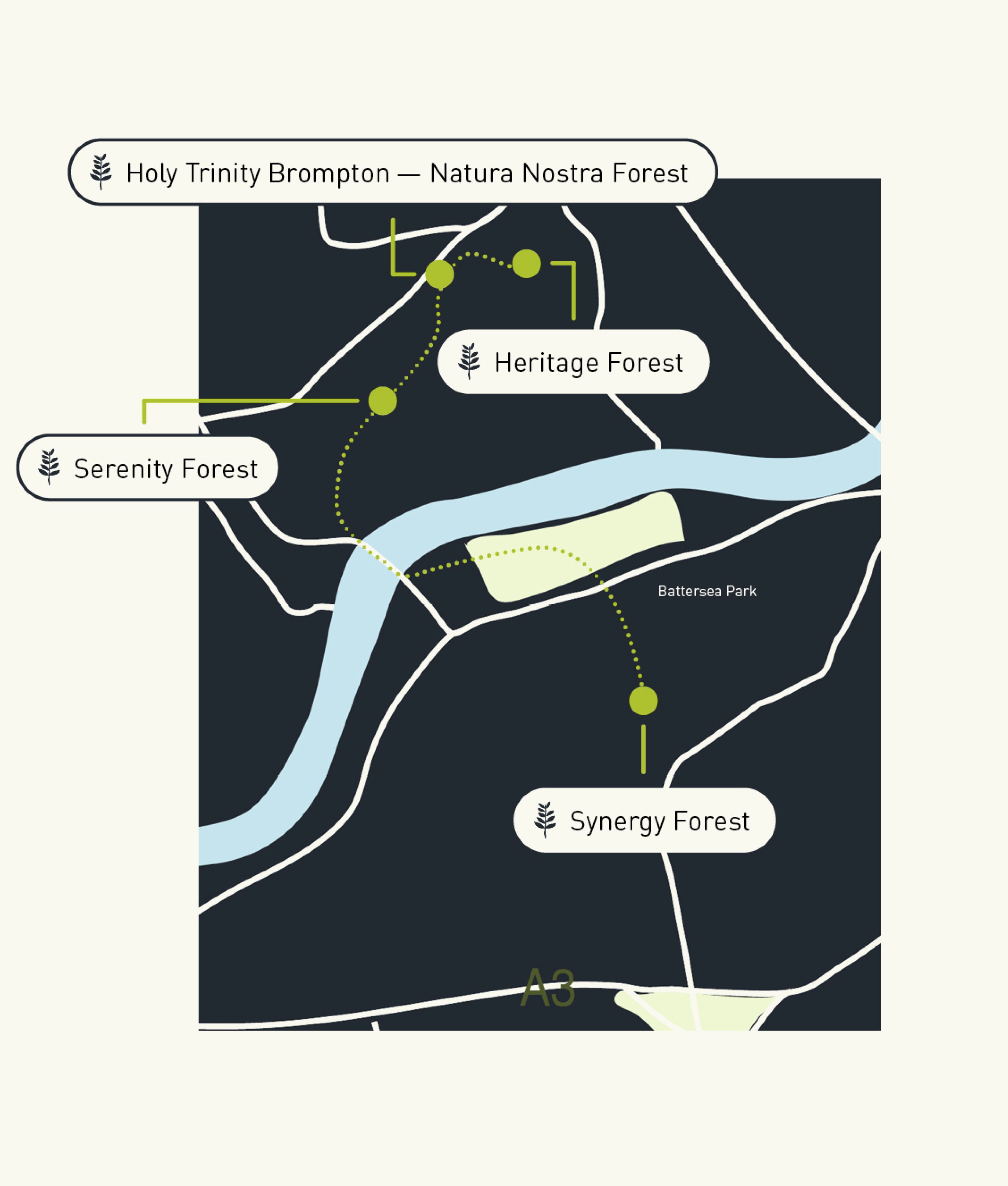
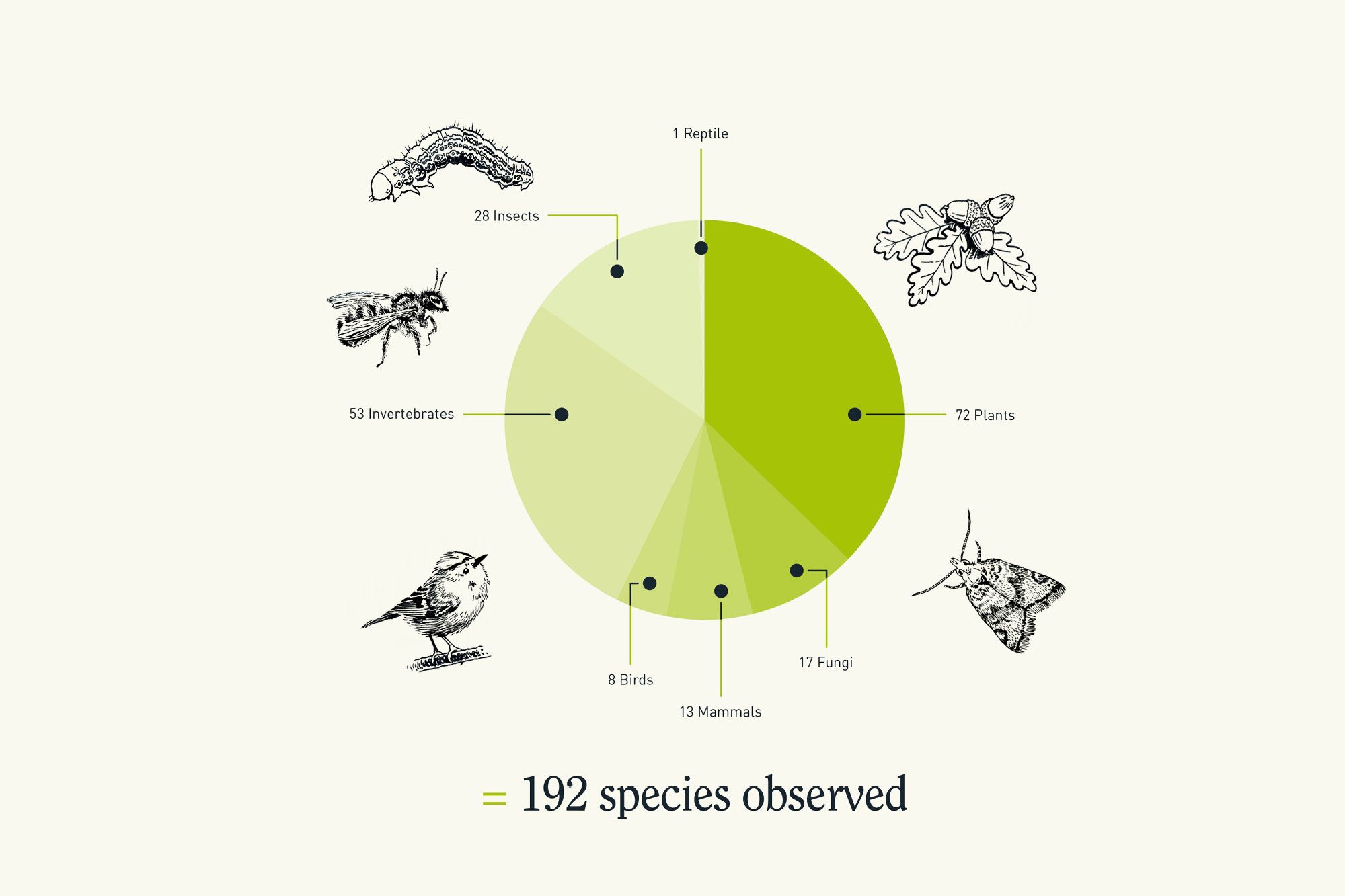
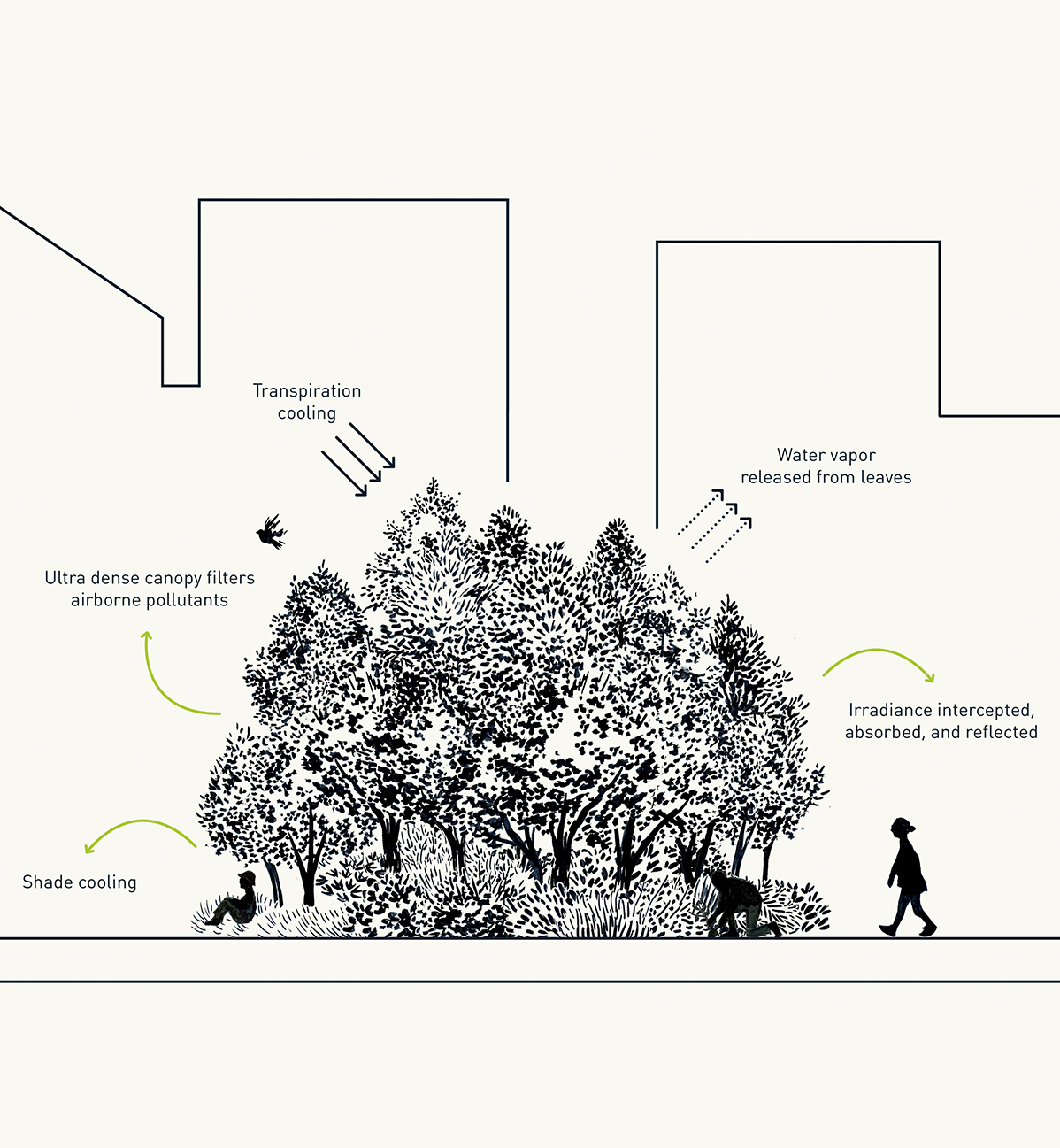
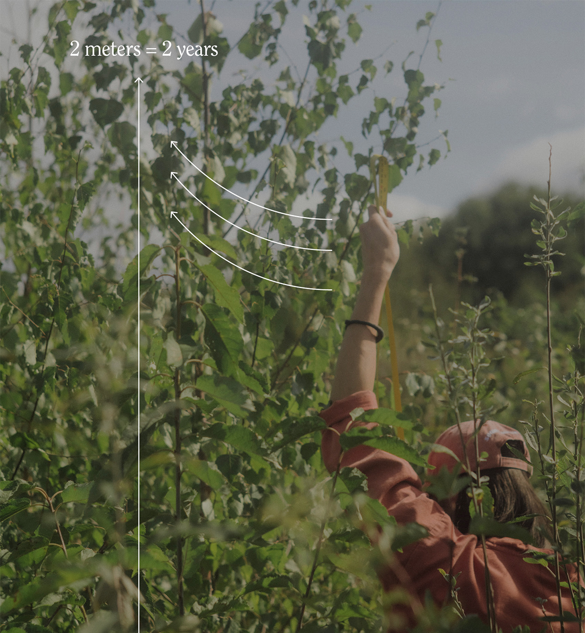
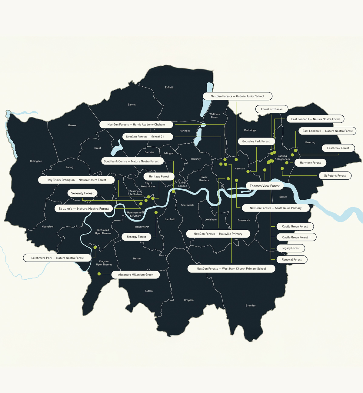
Blogpost:
London Pocket Forests
At the end of each year, SUGi publishes an impact report that looks back on the projects and stories that shaped the year. For the 2024 report, a key section focused on the London Pocket Forest Network: 26 forests across the city, alongside initiatives like SUGi Walks and Outdoor Classrooms, and the brief was to turn that into a clear, engaging blog post.
The content was varied and dense, ranging from stats and quotes to photography, graphs, and long-form text. The challenge was making all of it feel cohesive and easy to navigate, without losing the depth of the report. The solution was breaking the page into clear sections with strong headers, using carousels for imagery, animated text for key stats, and illustrations to help translate more scientific ideas into something approachable and readable.