
N
T
E
X
T
O
C
N
E
R
O
L
E
Co-creator & Creative Director
Alongside co-creating the project, I led the creative direction and design from start to finish, from shaping the name and manifesto to building the visual identity. I designed everything from the social media and newsletter assets to the newsletter itself, and also handled its ongoing creation and management.
A slow pop culture newsletter
Obsessive Snail is a newsletter my friend and I co-created, a slower corner of the internet for people who love art, music, film, and culture, but don’t want to chase every new release or trend. It was born out of that feeling of being obsessed, but tired of the pressure to keep up. We wanted to normalise a slower kind of fandom, one that celebrates the long-lasting love for a story, a song, or a scene that lingers long after the hype fades.
Obsession is often loud, cliché and chaotic, but we wanted something that speaks to an audience that still feels deeply but has grown out of teenage bedroom posters. The challenge was finding that balance: how do you make something that feels emotional and handmade, yet still clean, thoughtful, and editorial?
Problem
I leaned into the personal. The identity feels like flipping through a sketchbook: imperfect, curious, full of play and embracing the messy nature of obsession. I used my own writing as the main font, paired it with paper textures, taped photo cutouts, and snippets of text that looked as if they’d been plucked from a diary.
Solution
Branding
Creative Direction
Copywriting
Graphic Design
Motion Graphics
Editorial Design
E
S
V
I
S
B
O
N
L
I
A
S
S
S
E
P
O
C
Solution
I leaned into the personal. The identity feels like flipping through a sketchbook: imperfect, curious, full of play and embracing the messy nature of obsession. I used my own writing as the main font, paired it with paper textures, taped photo cutouts, and snippets of text that looked as if they’d been plucked from a diary.
Problem
Obsession is often loud, cliché and chaotic, but we wanted something that speaks to an audience that still feels deeply but has grown out of teenage bedroom posters. The challenge was finding that balance: how do you make something that feels emotional and handmade, yet still clean, thoughtful, and editorial?
N
C
O
T
X
E
T
Alongside co-creating the project, I led the creative direction and design from start to finish, from shaping the name and manifesto to building the visual identity. I designed everything from the social media and newsletter assets to the newsletter itself, and also handled its ongoing creation and management.
Co-creator & Creative Director
E
L
O
R
v2
v1
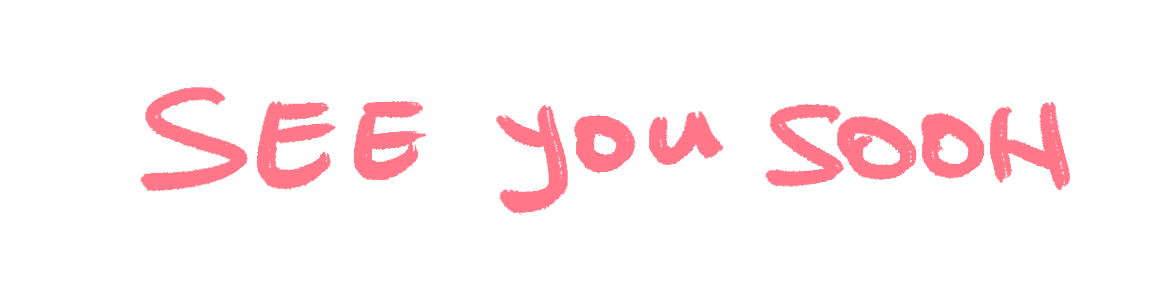
Finding handwritten organic looking fonts is a real task. After endless attempts, I decided that in order to make it even more authentic and sketchbook style, I would use my own handwriting.
Fonts
Visual Identity
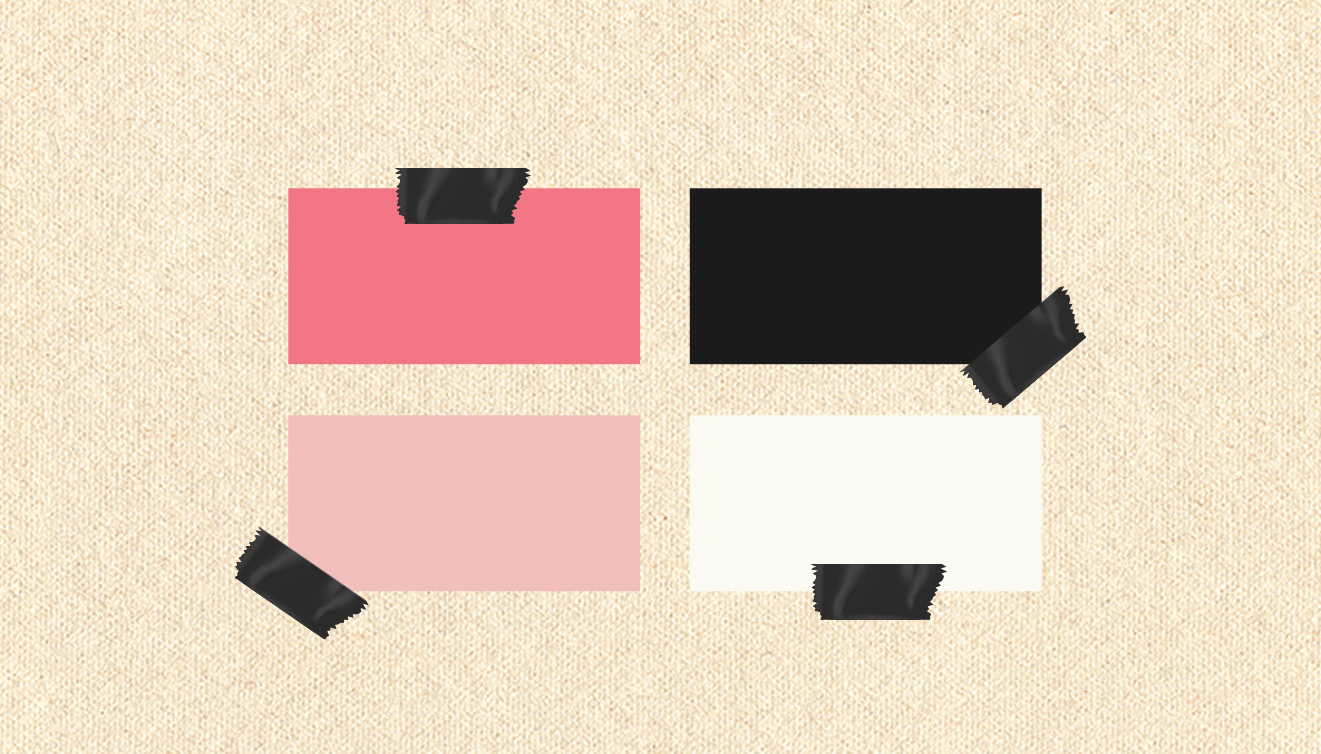
The initial instinct was to use vibrant, contrasting colours. But in the end I went with a brighter, pastel pink, accompanied by an off white and a black. The key elements for the visual identity are the paper texture and the tape which really bring the idea of cutouts/sketchbook to life.
The initial instinct was to use vibrant, contrasting colours. But in the end I went with a brighter, pastel pink, accompanied by an off white and a black. The key elements for the visual identity are the paper texture and the tape which really bring the idea of cutouts/sketchbook to life.

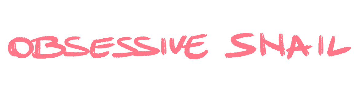
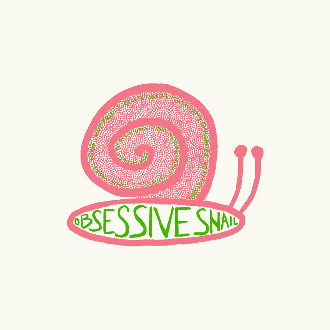
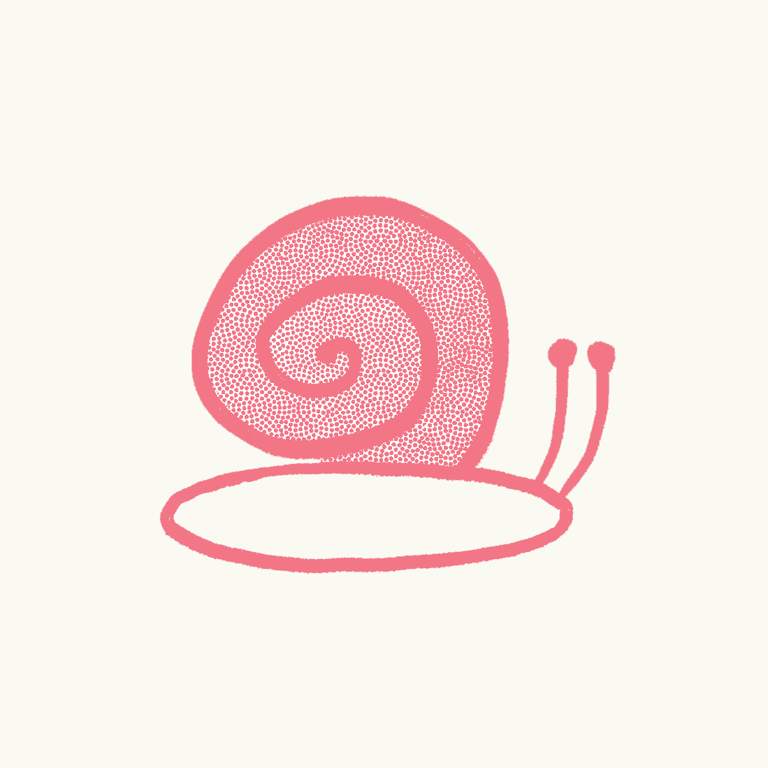
Naturally, the logo had to be a snail. I tried a couple of different snail options and landed on the more natural looking one. I then integrated the handwritten font in a swirl of key words we would be using throughout the newsletter.
Naturally, the logo had to be a snail. I tried a couple of different snail options and landed on the more natural looking one. I then integrated the handwritten font in a swirl of key words we would be using throughout the newsletter.
Logo
Name
We had to come up with a name that would smoothly connect the idea of pop culture, being obsessive with the slow burn approach. It also needed to stand out, roll off the tongue, be easy to remember and intrigue the audience. After ideas like 'useless info gurus' 'snail attack' or 'the obsessives,' I landed on 'obsessive snail' because it ticked all the boxes.
N
A
R
B
G
N
D
I

The header was the first thing the reader sees when opening the email, so it had to spark curiosity while keping the identity and their attention: a moving snail. I created a frame-by frame loop animation of the snail slowly making its way across the screen and leaving behind a trail.
Header
We could write about everything and anything pop culture or the arts, but we had 3 overall categories we tried to stick to: staning + the arts (hyper analysing a piece of media/art created by one of our favourite artists), rambles (think pieces about random topics we kept obsessing over) and art 101 (writing about art exhibitons we’ve been to and really enjoyed).
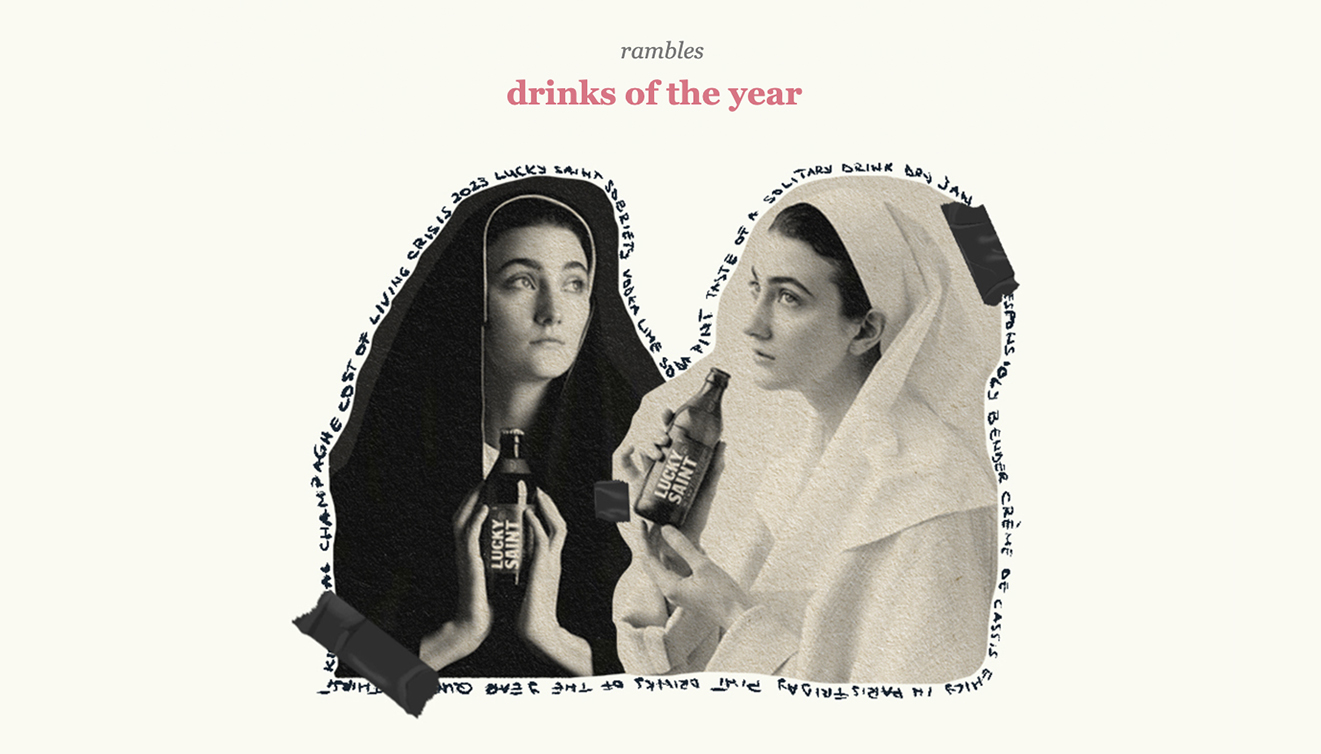
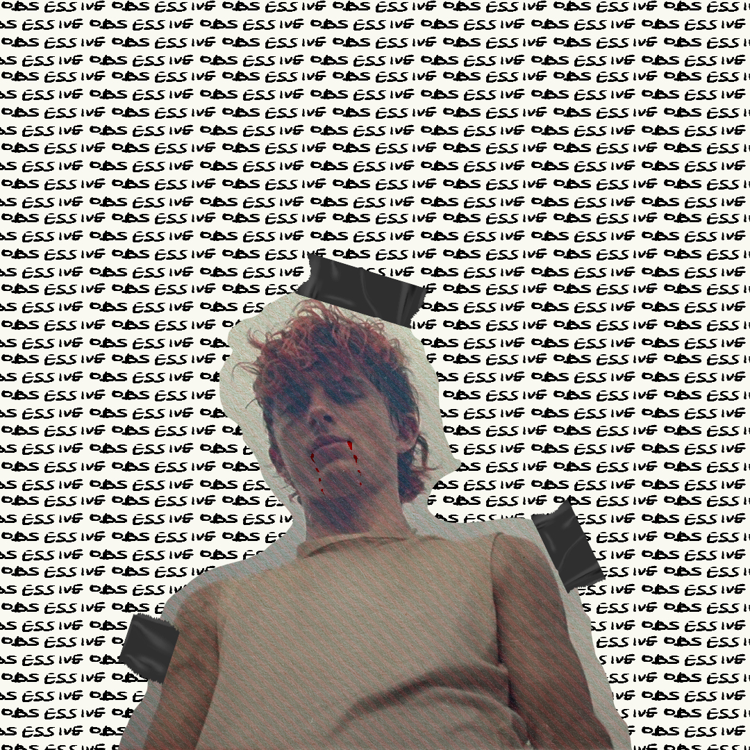
For the visuals, I combined all of the branding elements into a simple concept, the idea of a sketchbook being at the forefront. For each article featured in the newsletter, I’d pick one or two key images, turn them into cut-outs and add the paper texture. Then add the tape around it in a way that felt natural and surrounded the image with handwritten key words from the article.
Visuals
Structuring the newsletter was the key. We wanted to mimic a magazine, so we decided on having an editorial note as the intro to every newsletter. This would be a short text about the overall feel and overarching theme of the newsletter.
Structure + Content
R
E
E
L
T
T
N
E
W
S
v3
v2
v1
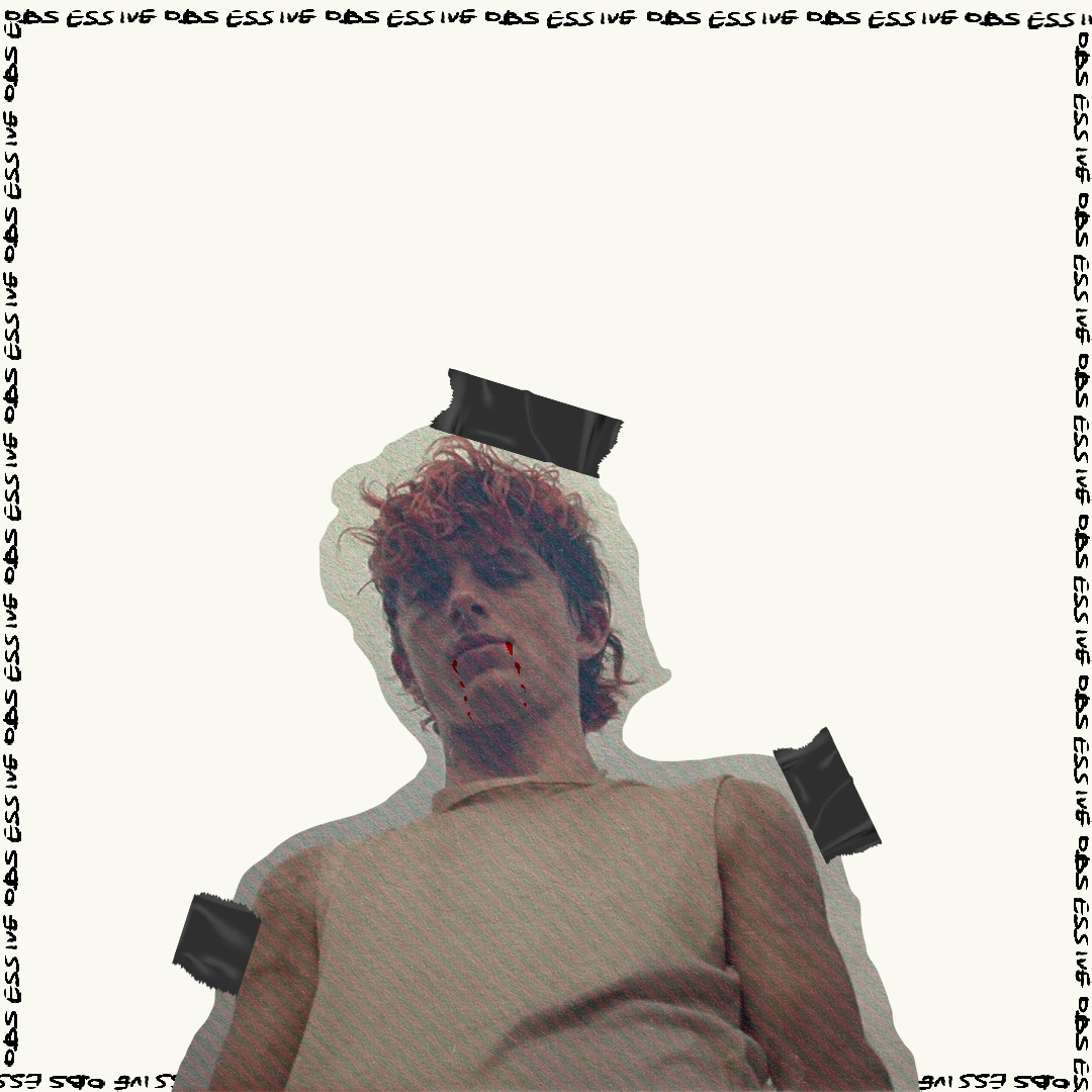
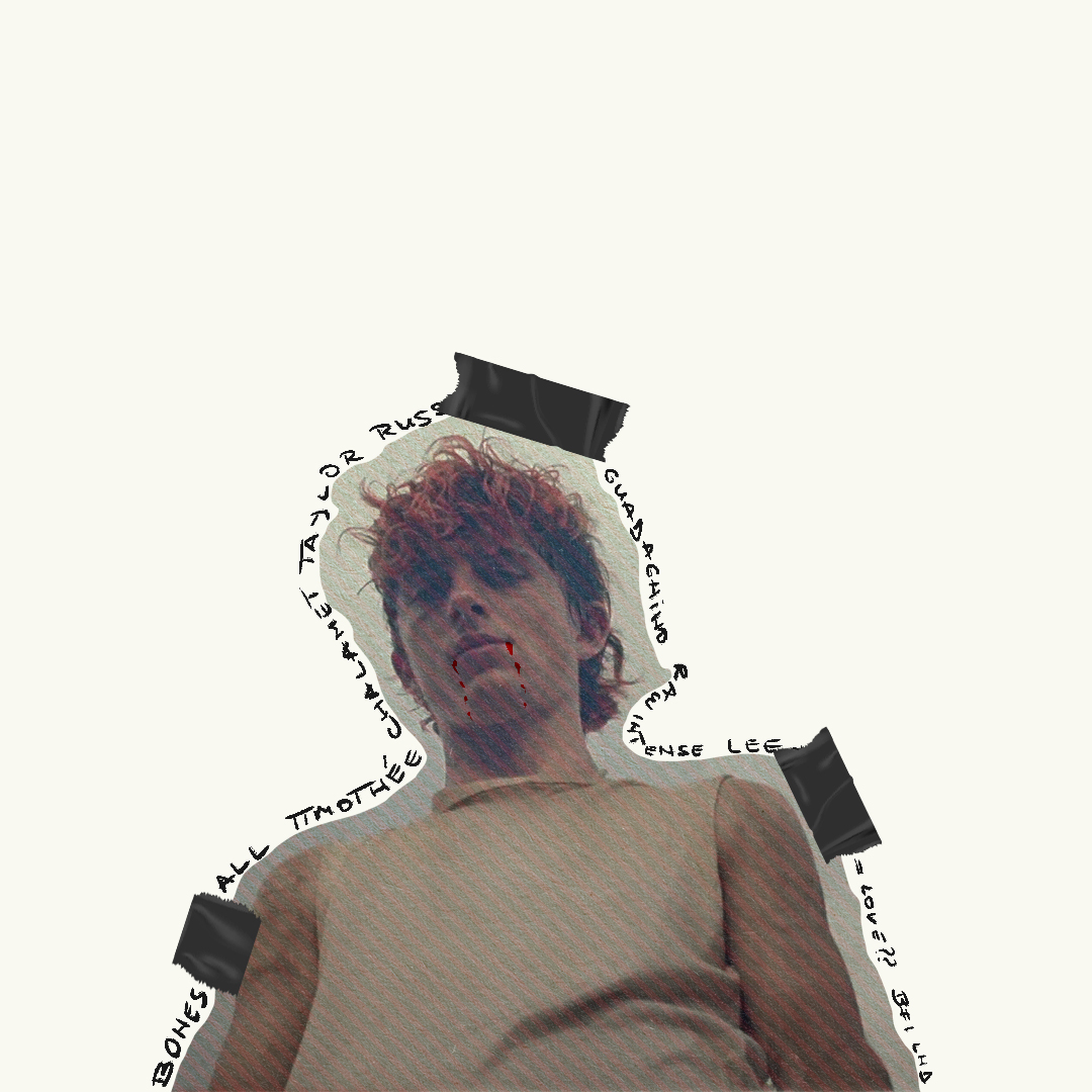
I explored a few other directions along the way: text running along the edges or repeating across the background to push the idea of obsession, but they quickly felt too busy (v1,v2). In the end, combining those ideas into a more minimalist layout gave the design room to breathe while still keeping that obsessive, handmade feel (v3).
A
I
I
C
O
S
M
A
L
E
D