The challenge was finding a visual language that respected the softness of poetry. It’s easy to over-design poems, to make them feel too abstract, decorative, or to distract from the words themselves. I wanted the poems to stay front and centre, simply set in a beautiful typeface and thoughtful layout, inviting enough that someone might want to display them.
Problem
I leaned into poetry’s quiet, timeless nature. Visually, I leaned into the simple literal meaning of the poems: what’s the image that instantly comes to mind while reading it? I used sketchy, hand-drawn line illustrations with an old-school feel, mostly in black with the occasional deep, vintage-toned colour. Frame-by-frame animation felt like the natural choice, slow, careful, and imperfect, echoing the tenderness and intention behind the words themselves.
Solution
E
P
O
O
C
S
O
O
S
E
P
C
E
E
N
T
X
T
O
C
I
R
S
S
P
M
E
H
E
T
E
R
O
L
E
Alongside co-creating the project, I led the creative direction and design from start to finish, from shaping the name and manifesto to building the visual identity. I designed everything from the social media and newsletter assets to the newsletter itself, and also handled its ongoing creation and management.
Creator


a poetry passion project
Poetry became a quiet anchor for me over the past years. I kept coming back to certain lines and verses that brought comfort, clarity, and a sense of being understood. I wanted to give those a physical presence, turning them into small pieces of art I could live with, look at, and hang on my wall.
Illustration
Animation
Graphic Design
Print Design
C
O
T
X
T
N
E
E
Solution
I leaned into poetry’s quiet, timeless nature. Visually, I leaned into the simple literal meaning of the poems: what’s the image that instantly comes to mind while reading it? I used sketchy, hand-drawn line illustrations with an old-school feel, mostly in black with the occasional deep, vintage-toned colour. Frame-by-frame animation felt like the natural choice, slow, careful, and imperfect, echoing the tenderness and intention behind the words themselves.
Problem
The challenge was finding a visual language that respected the softness of poetry. It’s easy to over-design poems, to make them feel too abstract, decorative, or to distract from the words themselves. I wanted the poems to stay front and centre, simply set in a beautiful typeface and thoughtful layout, inviting enough that someone might want to display them.
Visually, the idea felt very literal. I focused on
a front door as a threshold: something you open every day, never quite knowing what’s on the other side. Sometimes it’s just the ordinary passing by, like a car on the street; other times it’s unexpected and joyful, like balloons drifting into view, but always on the vibrant background of the place you’re living in.
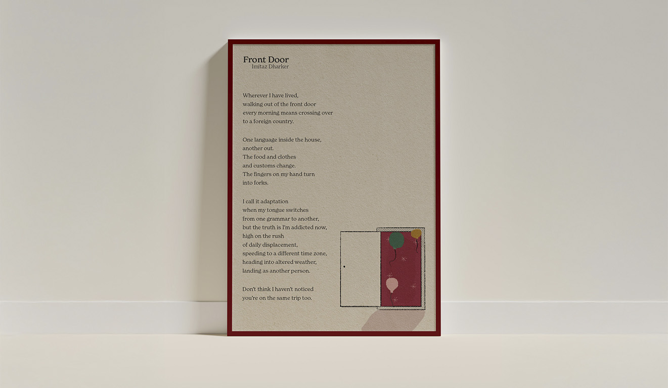
‘front door’ by imitaz dharker
This is a poem for those living in a different country to the one they were born into. I think many of us will be able to relate to what the poem is describing and know that specific feeling of being ‘high on the rush of daily displacement’ and that thrill of having a double life. Whenever I feel homesick or la bit untethered, I read this poem and somehow makes things feel lighter.
M
E
O
P
#
1
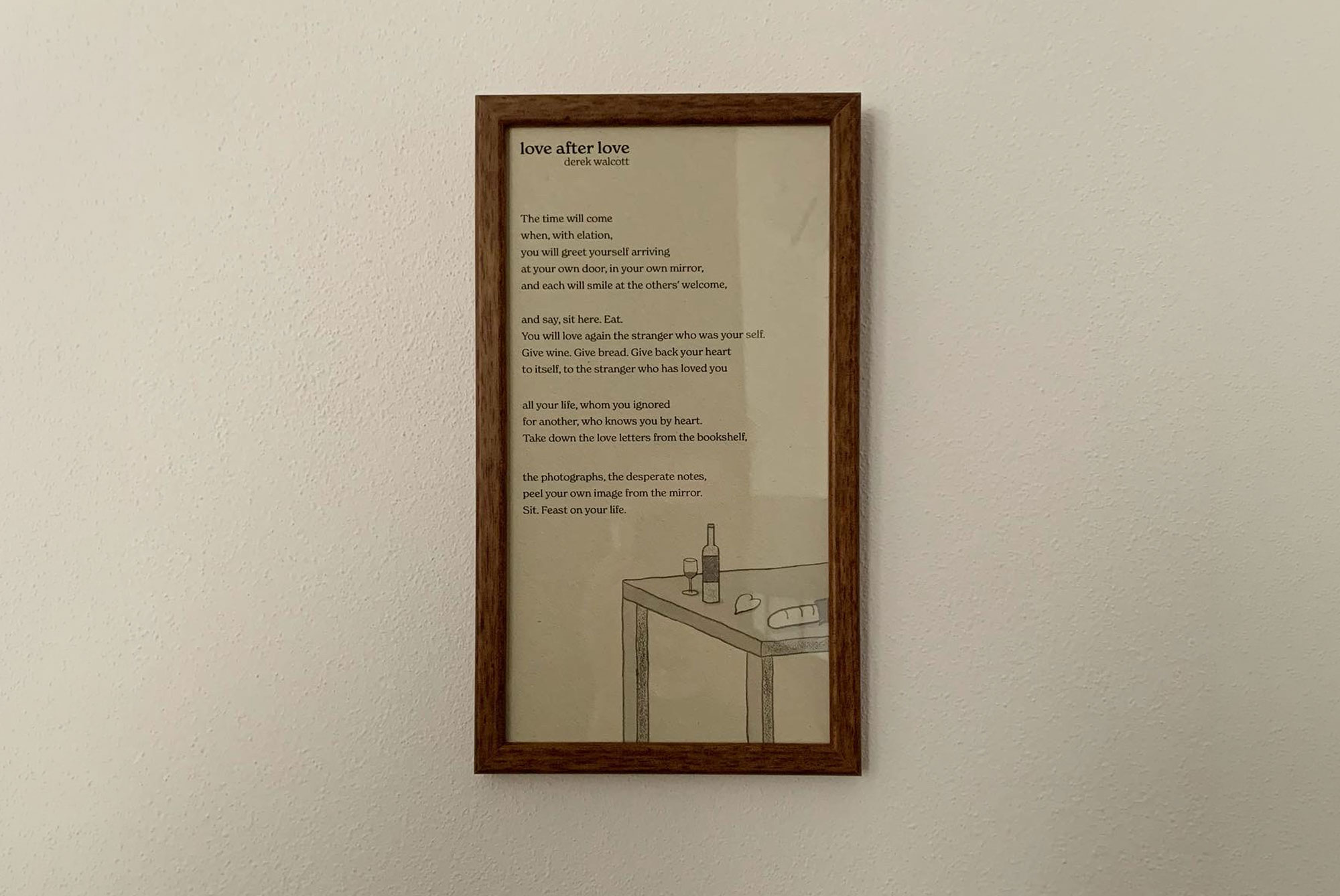
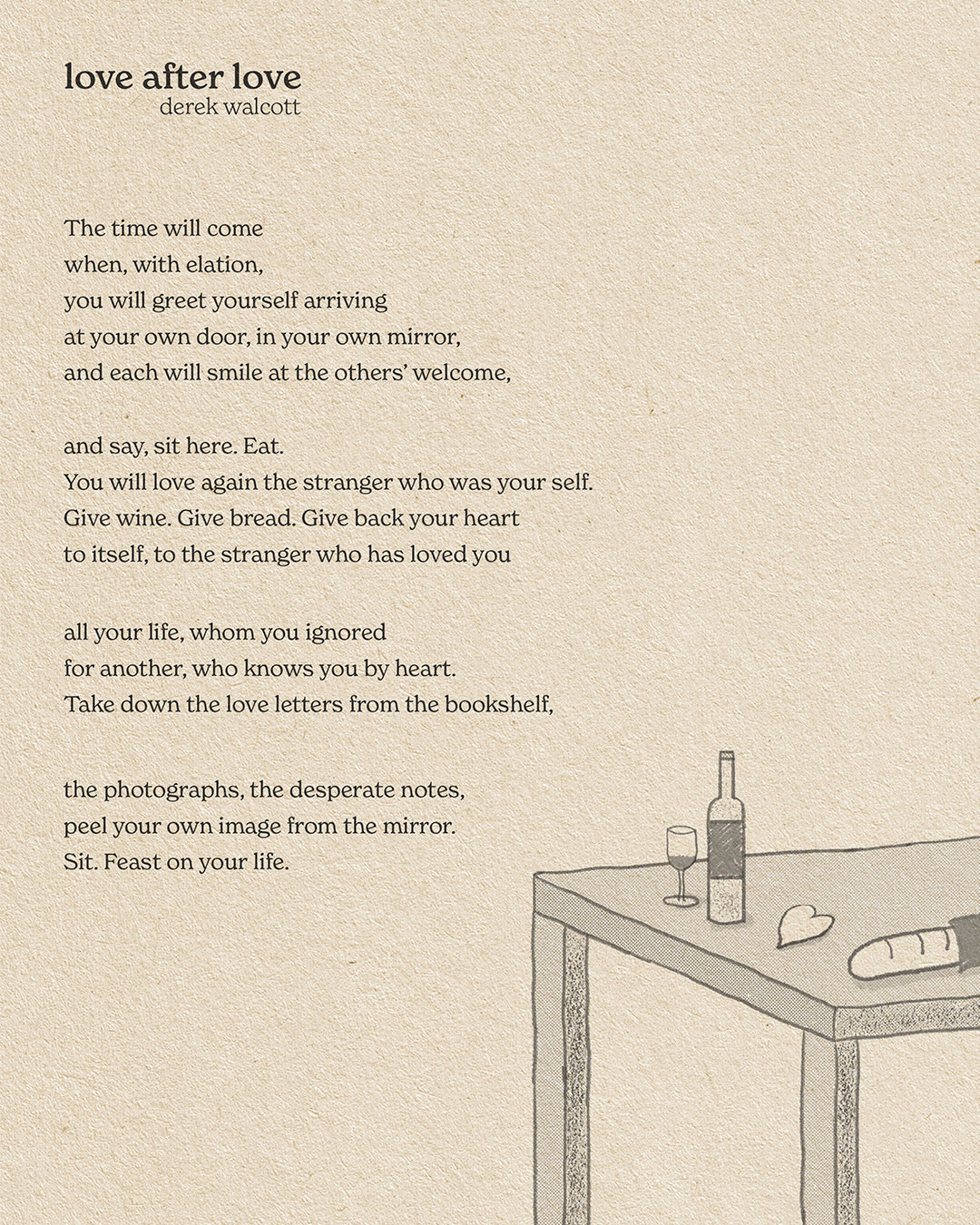
‘love after love’ by Derek Walcott is a poem about becoming friends with yourself again. Whatever we've been through or whoever broke our hearts, the only person that can really help and soothe us is ourselves. But we more often than not ignore that person the most and this poem is a daily reminder to always come back to ourselves even in the darkest of times.
‘love after love’ by derek walcott
For this one I wanted to create something very simple, echoing the meaning behind the words: simple and gentle everyday actions that will bring yourself back to yourself. So I laid on a table the simple things you need to give back to yourself: wine, bread, your heart. They are there waiting for you to finally grab them back.
2
#
P
O
E
M
The image that followed was immediate: a wall breaking apart, an opening forming, a heart finally finding its way through. The visual became a literal translation of that emotional release.
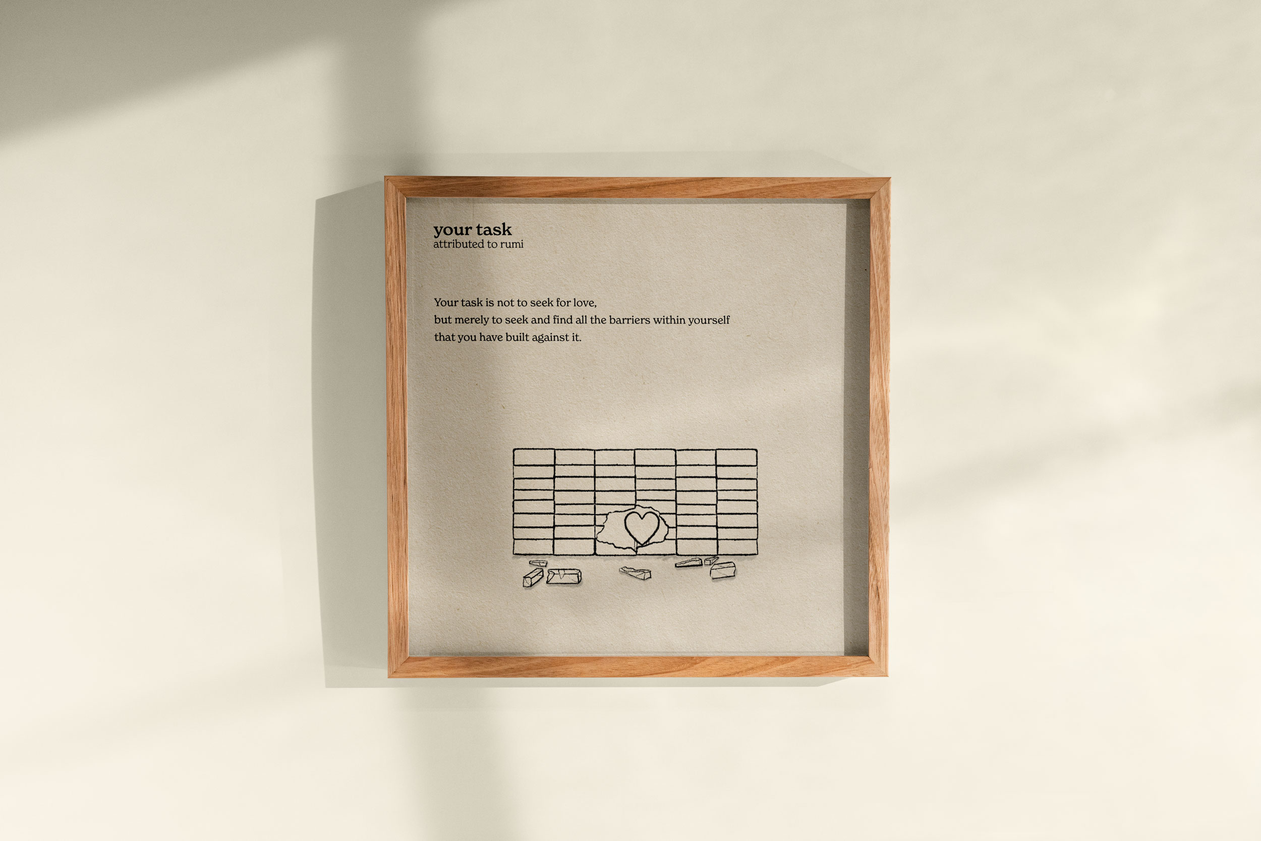
‘your task’ by rumi
A short and eye-opening poem about love. For anyone who has ever wondered why love has not found them yet, the answer might just lie in these few simple, yet surprisingly freeing words - you just have to tear down what’s in the way. After I first read it, I had one of those ‘ah, of course’ moments.
M
3
#
E
O
P
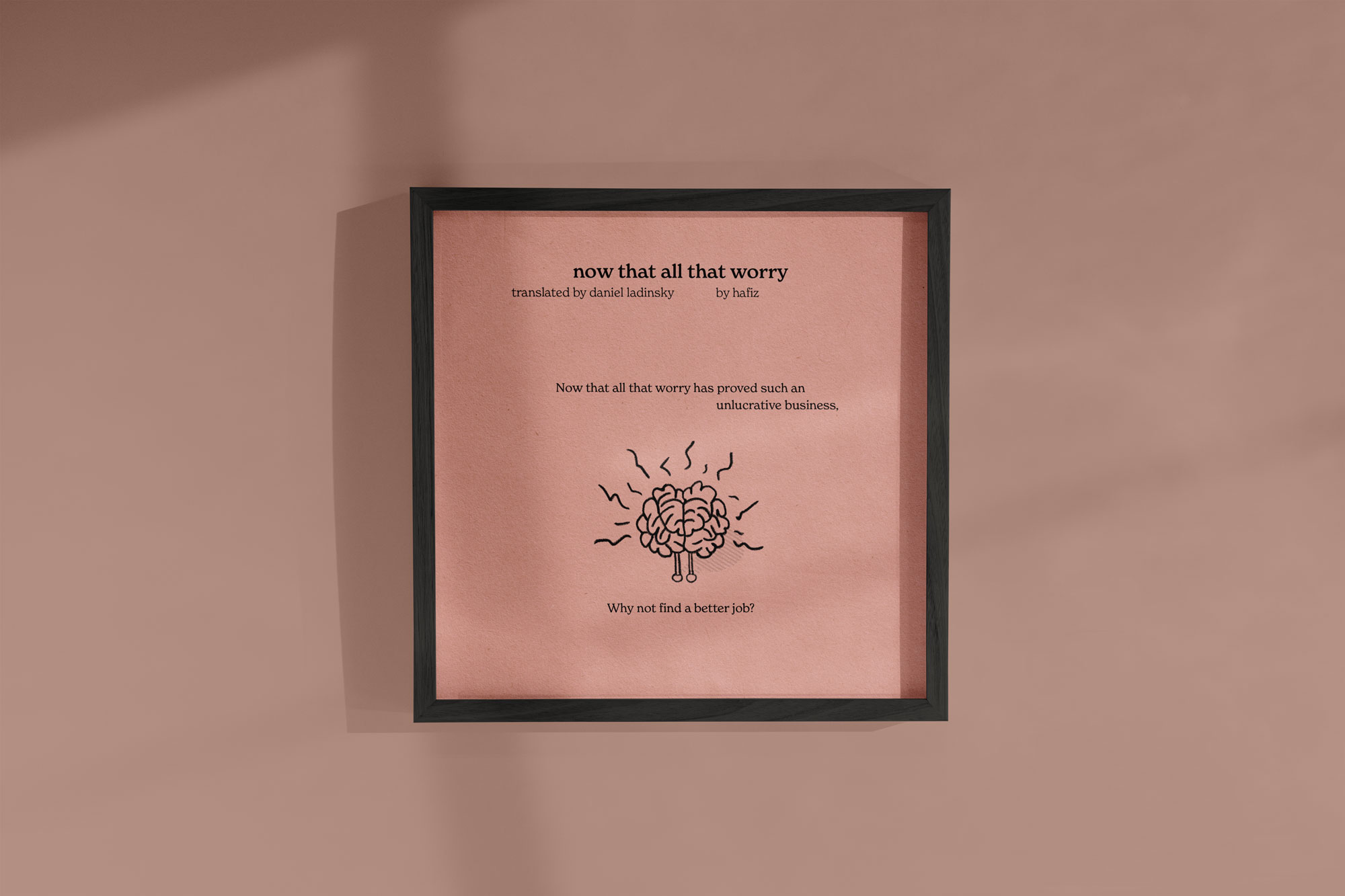
For this piece, I leaned into a more playful layout. I illustrated overthinking as a brain radiating noisy, scattered energy. I separated the final line from the rest of the poem – when I read it, it felt like a punchline, the obvious truth that lands best after a pause.
‘now that all your worry’ by hafiz
This is a poem for the overthinkers. In a world where we’re constantly overwhelmed by information, it’s reassuring to discover such a simple and straightforward way of looking at things. Worrying about something is like going through that thing twice, which sounds a bit pointless.
M
4
#
E
O
P