











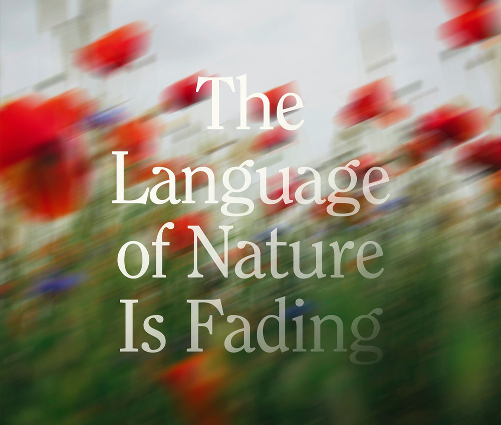
The idea behind this post was to capture the feeling of a language slowly fading; a language that has been part of people’s lives for centuries, but is at risk of being forgotten.
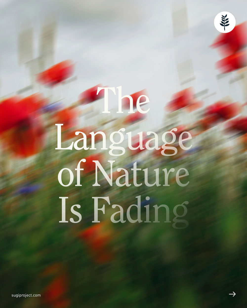
For the cover, I played with a sense of motion, like the viewer is passing by and not fully noticing the world around them, taking it for granted, forgetting it’s there. The text was kept simple and clean, with a fading gradient that followed the direction of the image’s movement, reinforcing the theme of disappearance.
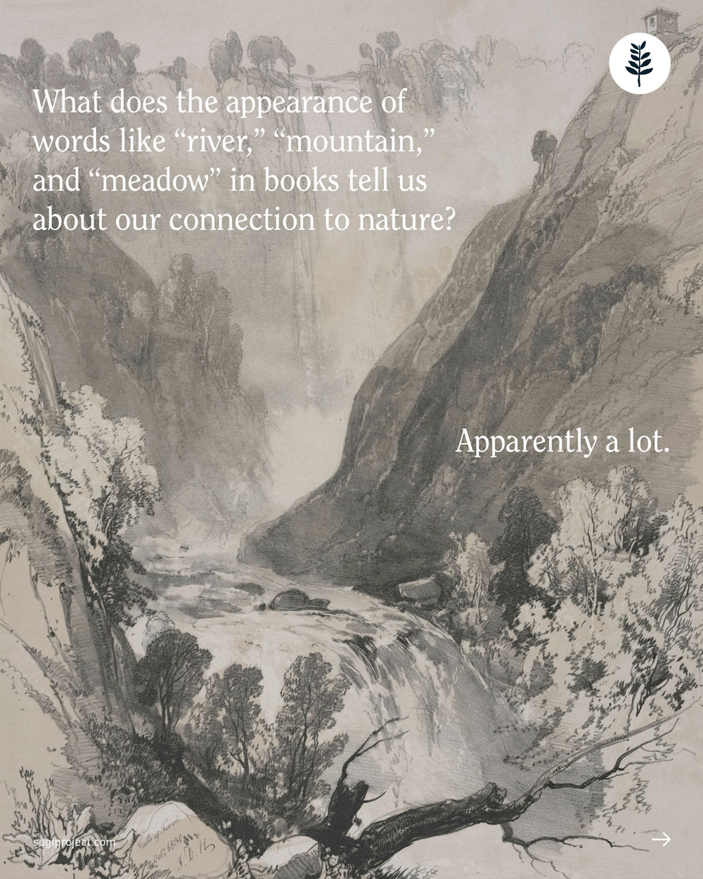
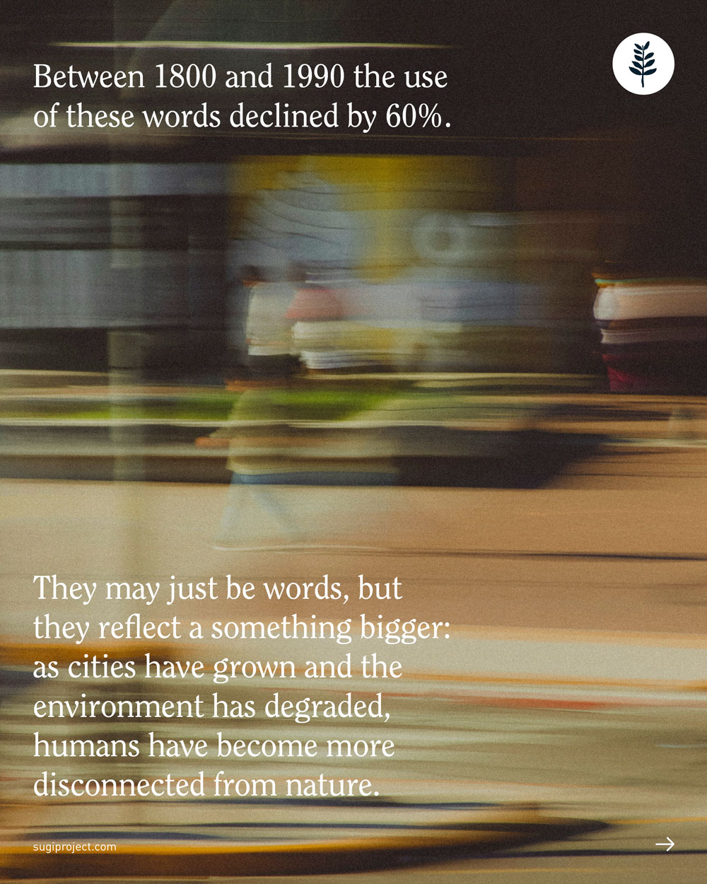
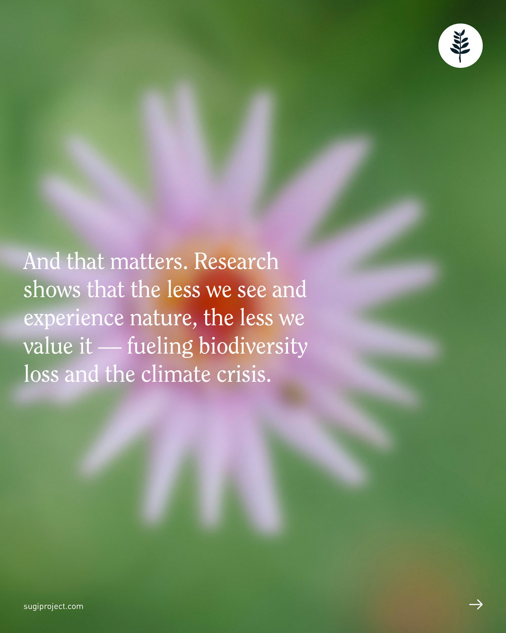
Inside, the post moves from an old photograph to more modern images and styling, with a third slide mirroring the cover’s motion in a rushed city scene, everything a blur.
Social post
Southbank Forest

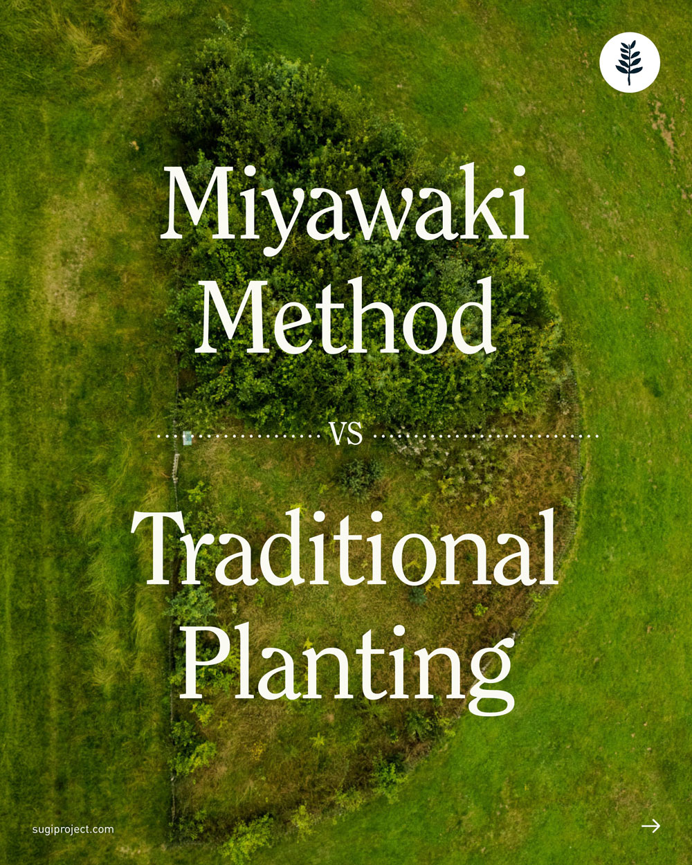
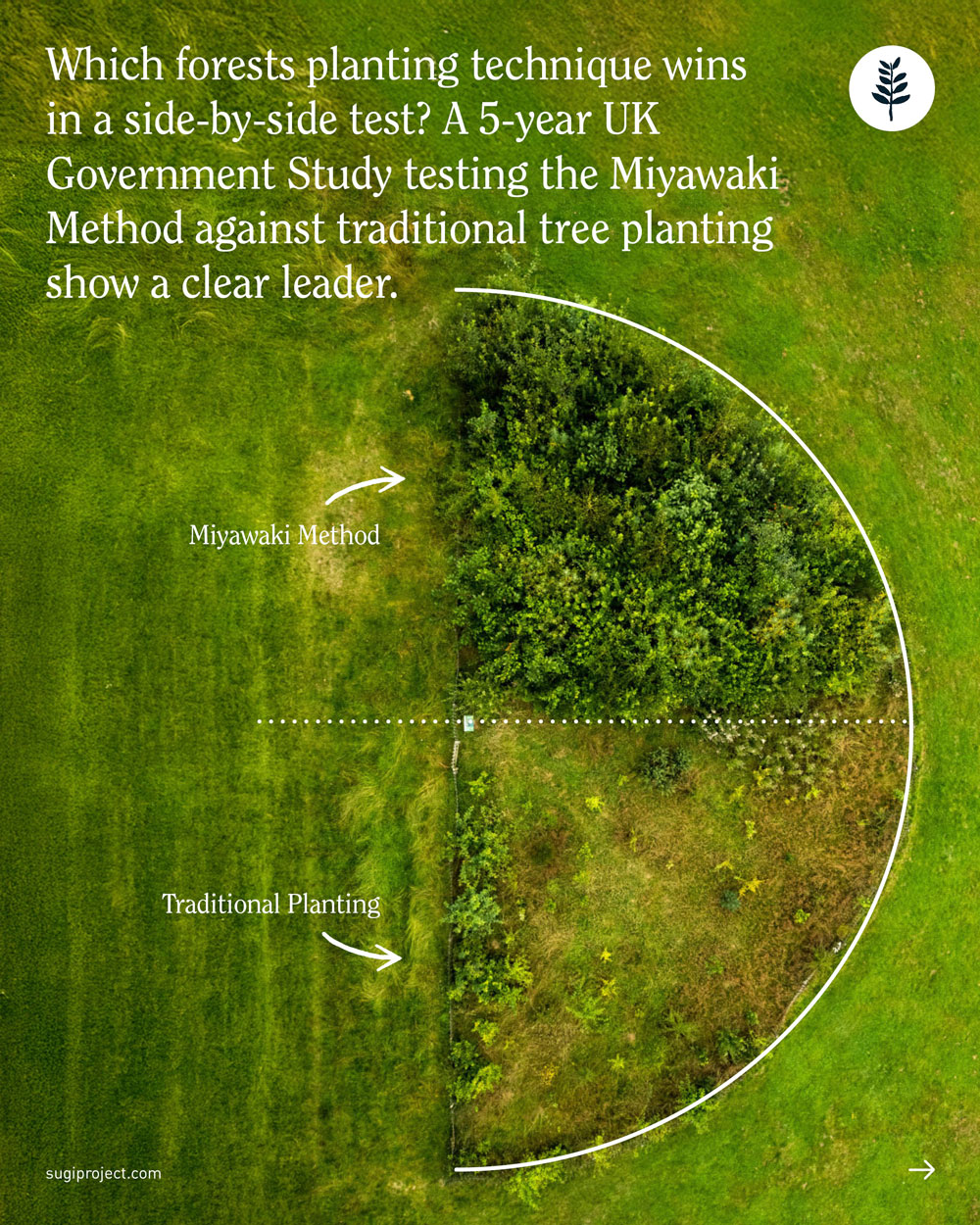
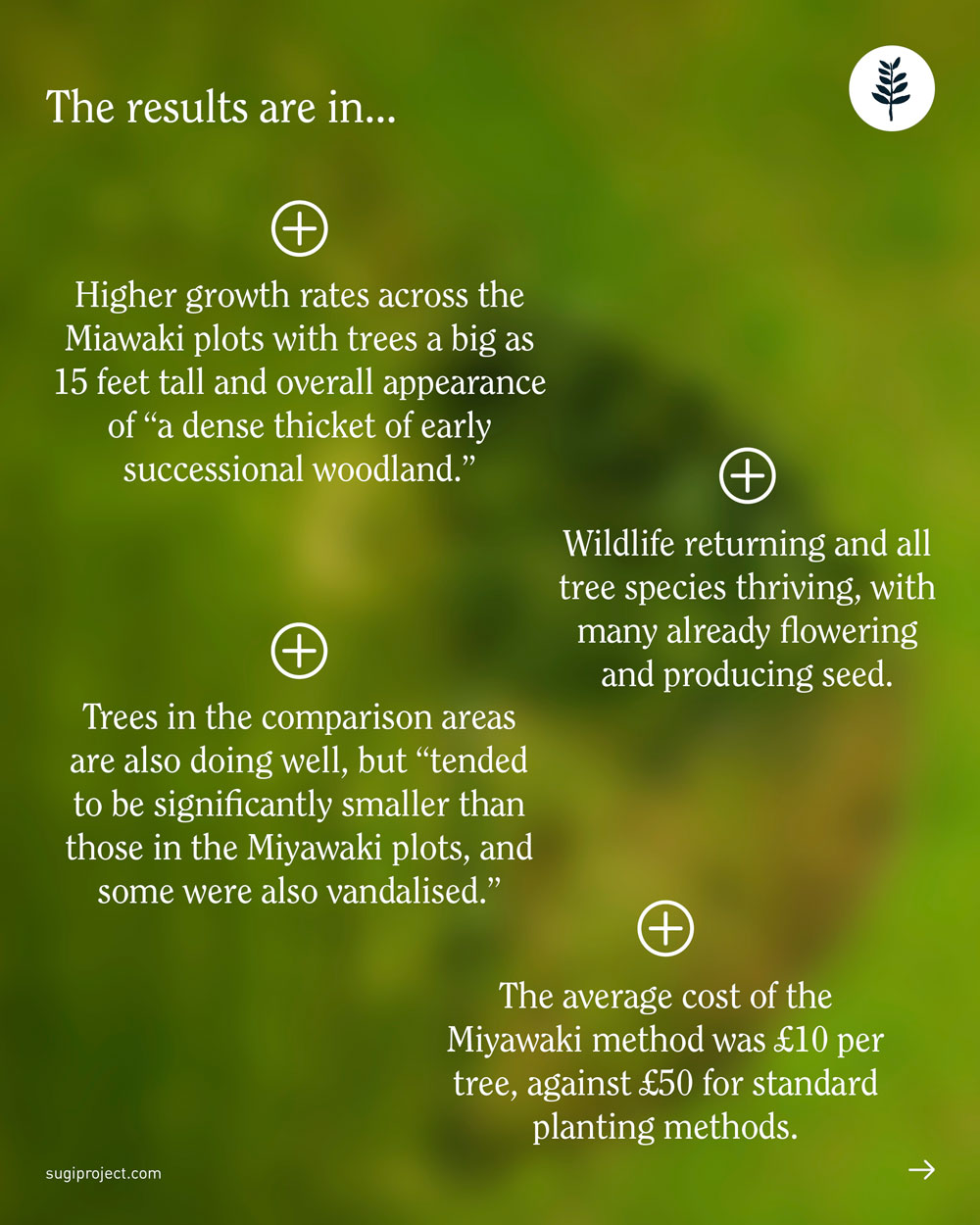
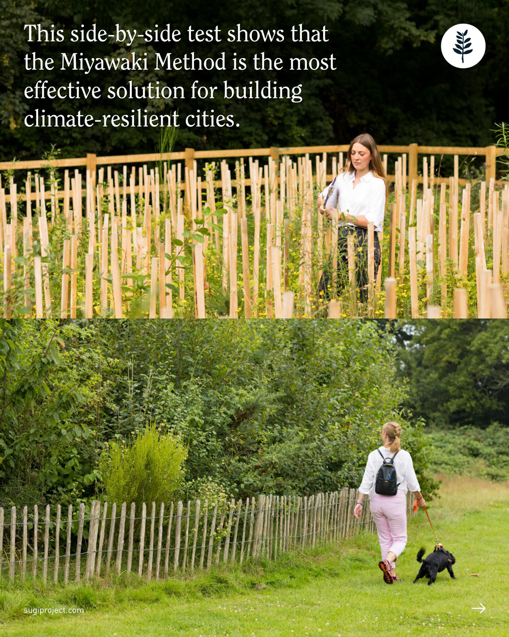
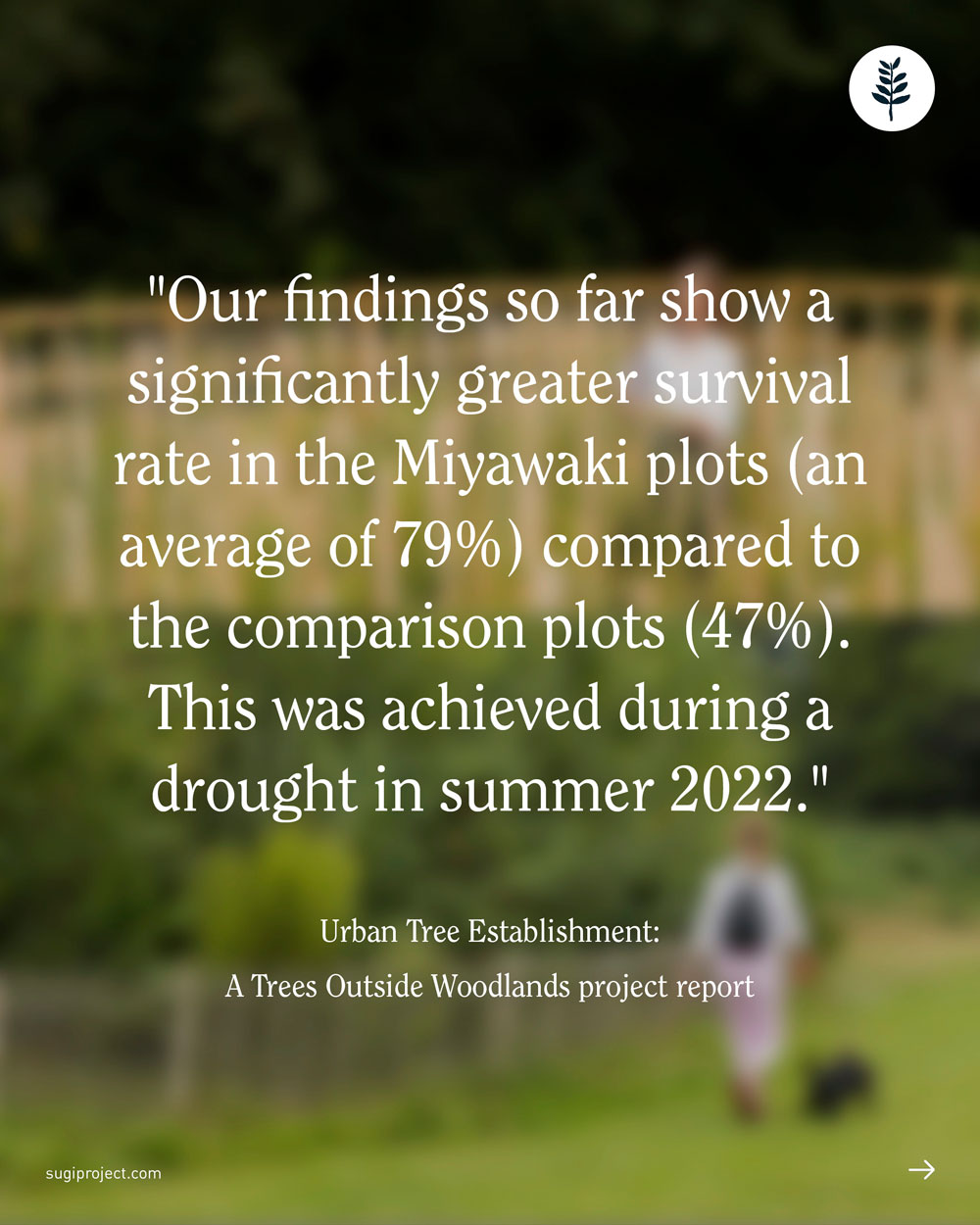
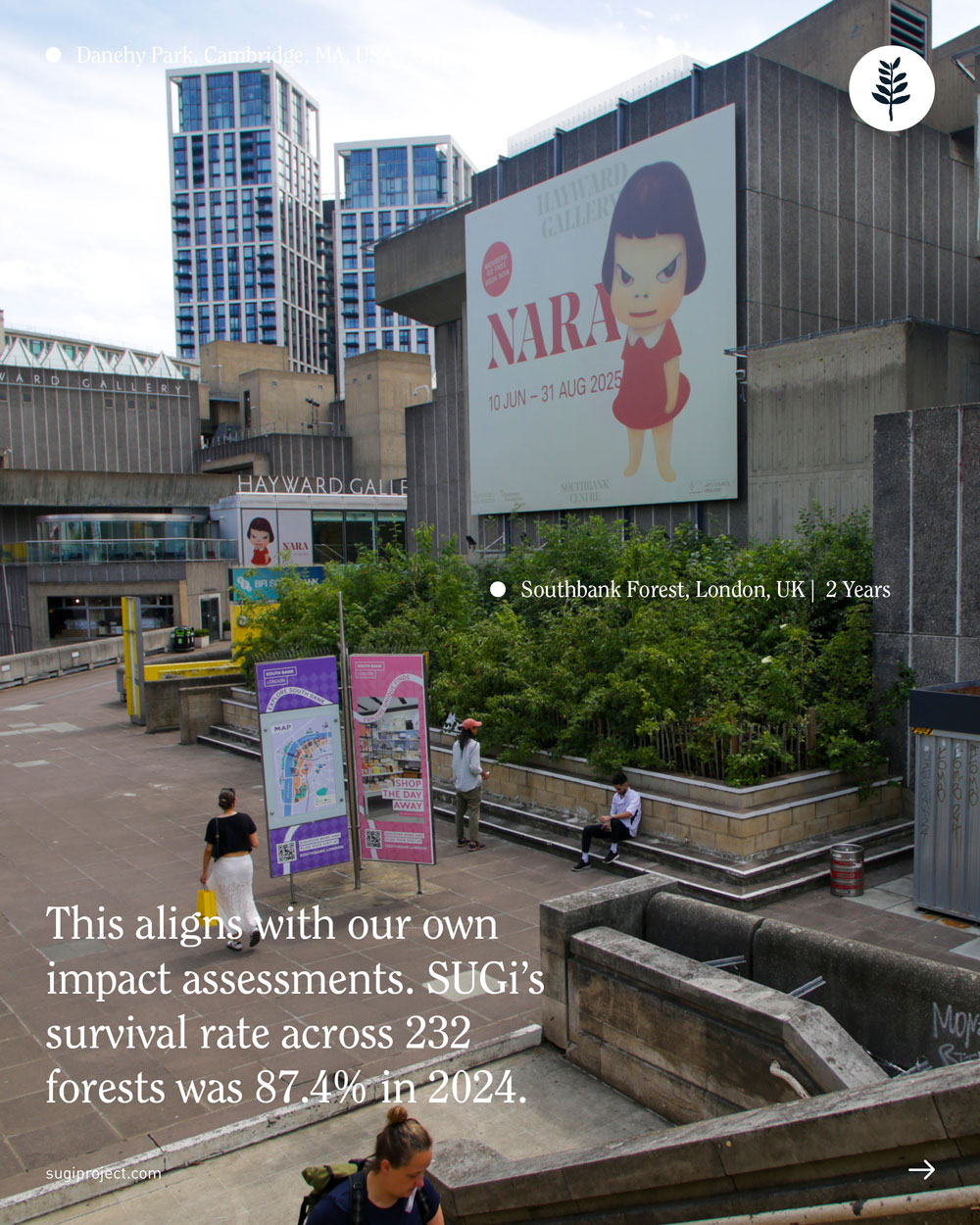
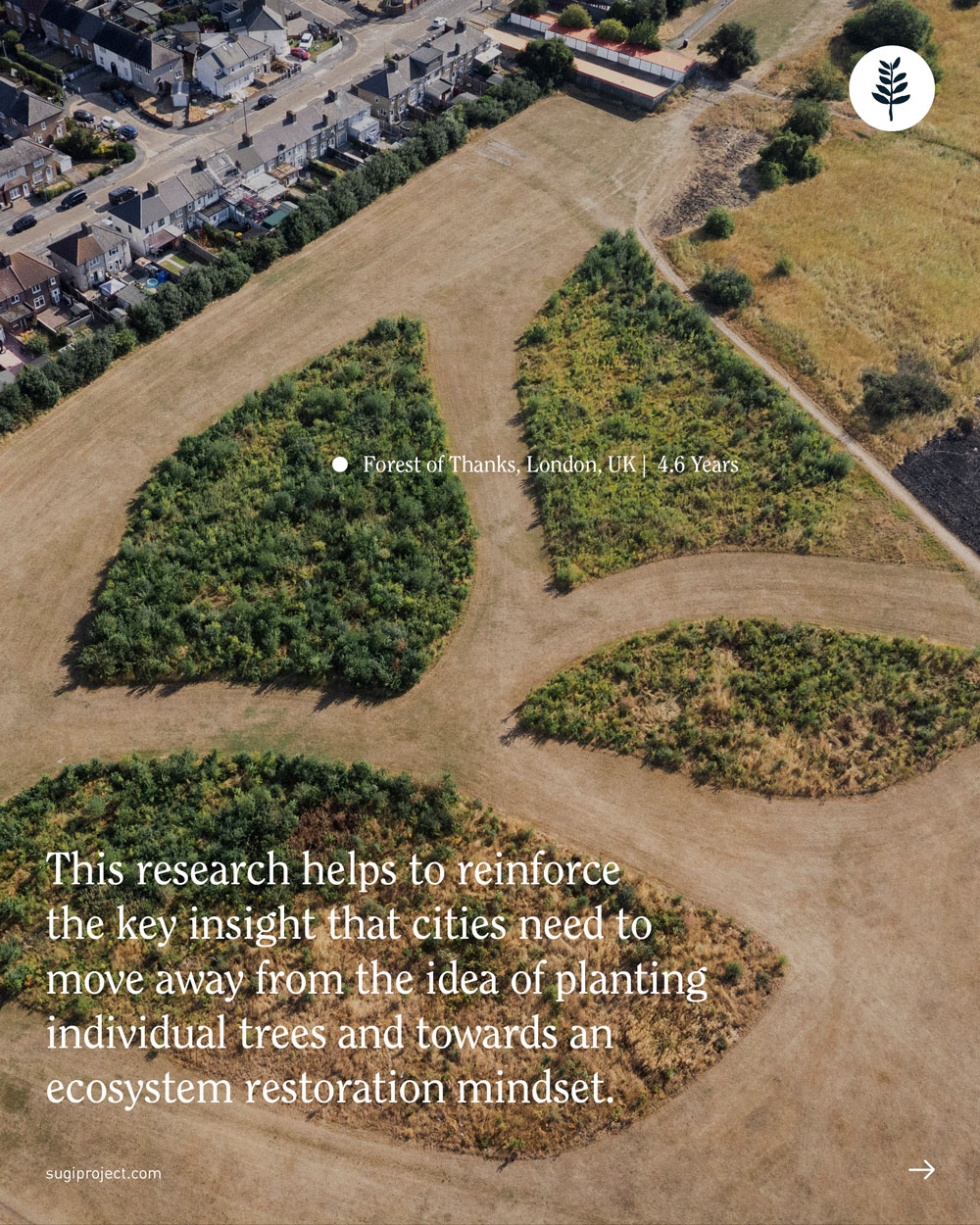
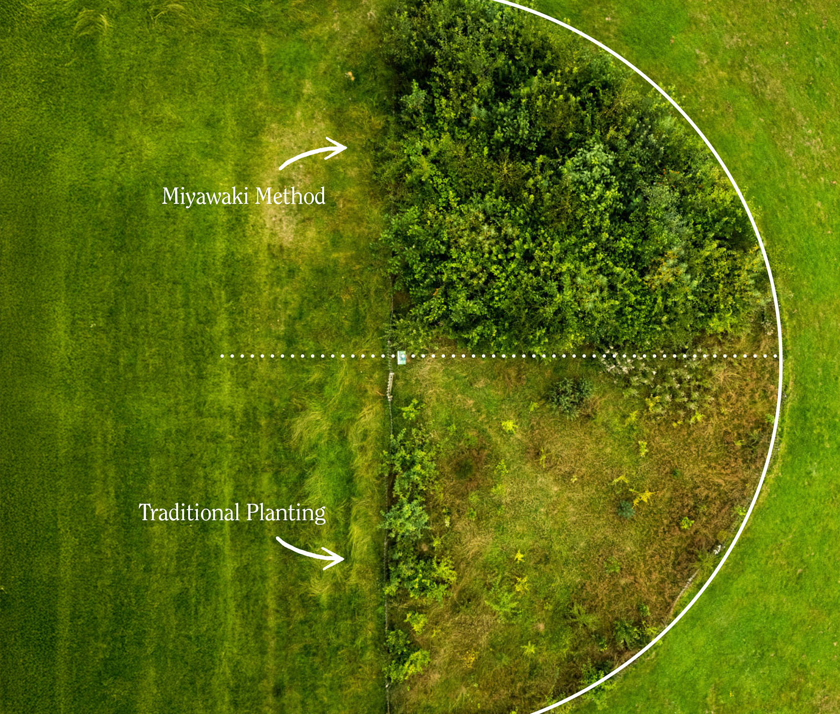
This post dives into the science behind the Miyawaki Method, the planting technique SUGi uses to create thriving urban forests, and how it stacks up against traditional planting methods. The goal was to show just how much more efficient and effective this method is, based on a study by leg by British Government.
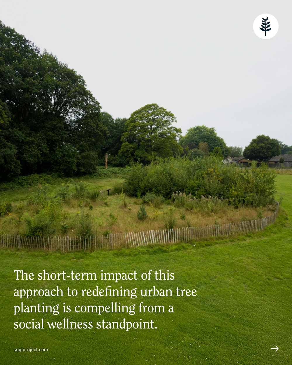
I designed the cover to be bold and graphic, making the contrast between the two techniques immediately clear. Inside, the post keps a simple, visual style, using lines, arrows, and symbols to make the findings of the study easy to follow. To bring it to life, I connected the research to SUGi’s Miyawaki forests in London, showing their incredible growth and diversity. The aim was to educate while also sparking curiosity.






Social post
Miyawaki Method vs Traditional Planting
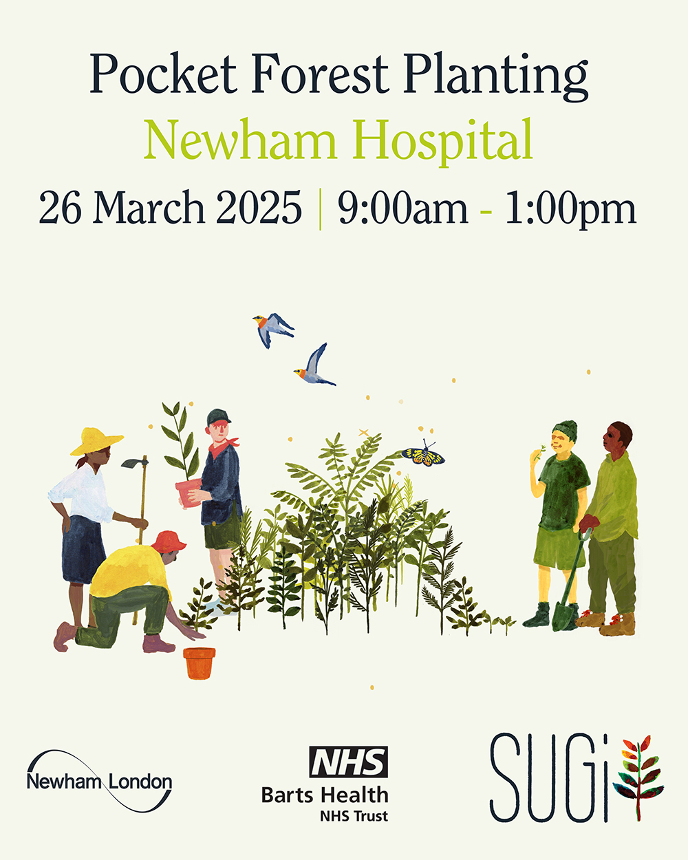
For a pocket forest planting at a hospital in London, we needed a poster to invite the hospital staff to join the event. The goal was to create something in the SUGi style that would catch attention, spark curiosity, and clearly convey the essential details: time, place, purpose, and partners.
We experimented with several layouts, using SUGi illustrations to show both the planting process and the end result and exploring different levels of detail. In the end, I went with a simple, clean approach: a clear illustration, the essential information front and center, and the partners’ logos, making it approachable, easy to read, and visually engaging.
Poster
Newham Hospital Forest Planting
Poster
Newham Hospital Forest Planting
For a pocket forest planting at a hospital in London, we needed a poster to invite the hospital staff to join the event. The goal was to create something in the SUGi style that would catch attention, spark curiosity, and clearly convey the essential details: time, place, purpose, and partners.
We experimented with several layouts, using SUGi illustrations to show both the planting process and the end result and exploring different levels of detail. In the end, I went with a simple, clean approach: a clear illustration, the essential information front and center, and the partners’ logos, making it approachable, easy to read, and visually engaging.
This post dives into the science behind the Miyawaki Method, the planting technique SUGi uses to create thriving urban forests, and how it stacks up against traditional planting methods. The goal was to show just how much more efficient and effective this method is, based on a study by leg by British Government.
I designed the cover to be bold and graphic, making the contrast between the two techniques immediately clear. Inside, the post keps a simple, visual style, using lines, arrows, and symbols to make the findings of the study easy to follow. To bring it to life, I connected the research to SUGi’s Miyawaki forests in London, showing their incredible growth and diversity. The aim was to educate while also sparking curiosity.
Miyawaki Method vs Traditional Planting
Social post
Social post
The Language of Nature is Fading
The idea behind this post was to capture the feeling of a language slowly fading; a language that has been part of people’s lives for centuries, but is at risk of being forgotten.
For the cover, I played with a sense of motion, like the viewer is passing by and not fully noticing the world around them, taking it for granted, forgetting it’s there. The text was kept simple and clean, with a fading gradient that followed the direction of the image’s movement, reinforcing the theme of disappearance.
Inside, the post moves from an old photograph to more modern images and styling, with a third slide mirroring the cover’s motion in a rushed city scene, everything a blur.